Skip to content
← All projects
Group project · test protocol

Testing an app you explore like a map

A fashion marketplace you browse by zooming, put to the test with 5 participants and eye-tracking glasses.

Testing the prototype ↗
Testing
November 4, 2026 · 60 min per participant
My role
Protocol, test sessions, analysis
Team
Clémence Buffa, Luca Guillemot, Cyriac Kouatouka, Maroua Oirdi and me
Method
Moderated testing, Tobii Pro eye-tracking, interviews
The context

On a fashion app, you scroll through product grids until you stop seeing anything. Orbit lets you explore the catalog like a map, zooming from one universe to the next.

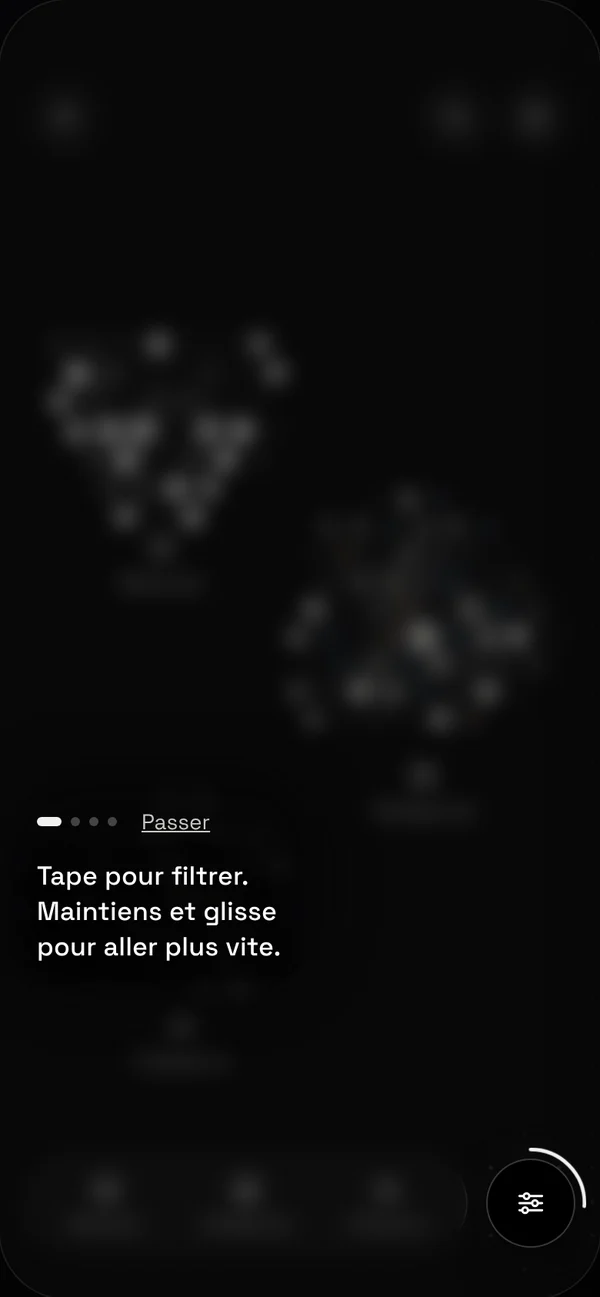
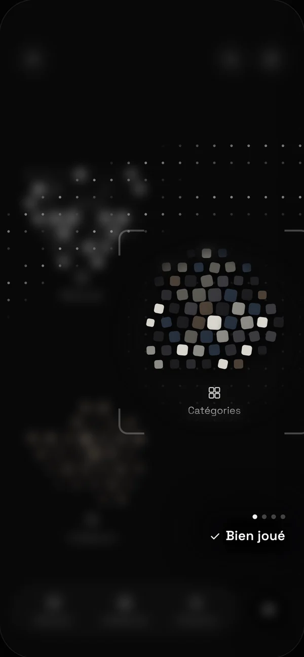
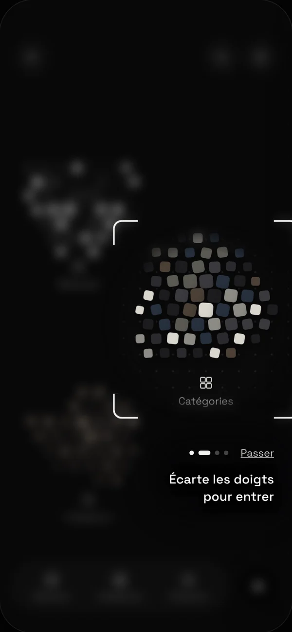
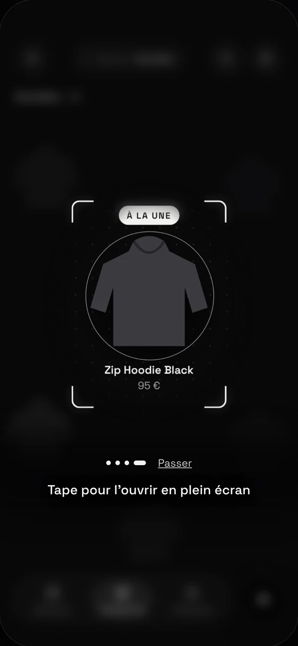
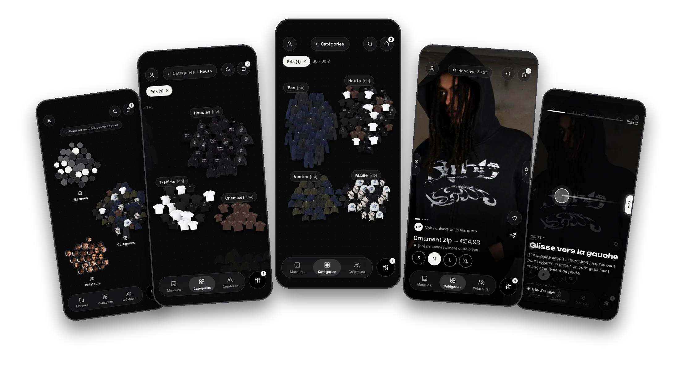
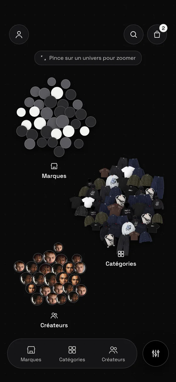
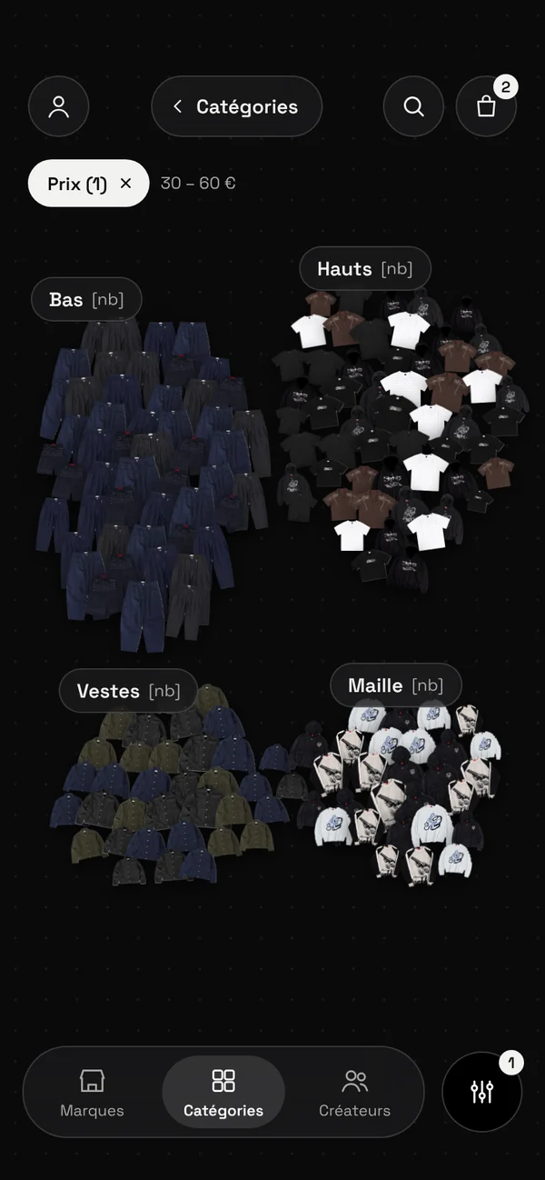
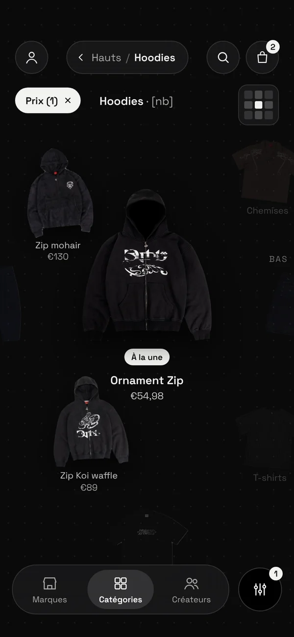
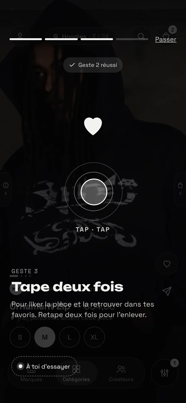
Three universes, Brands, Categories and Designers, laid out like constellations. You zoom in to enter, zoom out to go back, and each piece opens full screen with gestures to like it, view details or add it to the cart. It's a bold concept, but it relies on gestures nobody has learned yet. The prototype, built with vibe coding, had to stand up to real users.

My starting question: Is the immersive navigation understandable, intuitive and effective, from discovering a product through to purchase?

5participants, in one-on-one tests
6hypotheses to validate
5scenarios, from the map to checkout
3sources cross-referenced: observation, gaze, interview
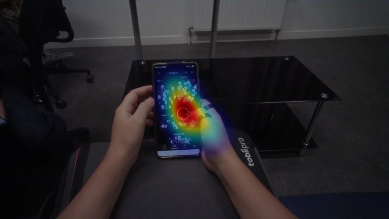
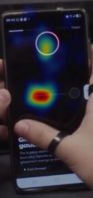
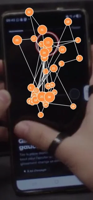
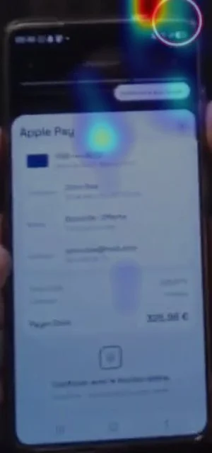
View from the Tobii Pro glasses camera during a test: the gaze heatmap on the phone screen
01The prototype

What we put in participants' hands

A functional mobile prototype, not a clickable mockup: the map really moves and zooms, and the gestures work. You can try it yourself with the button at the top of the page.

What I take from it

Every gesture and every zoom level was a bet. The protocol had to tell us which ones held up, and which ones needed rethinking.

Next step · 02 The protocol ↓
02The protocol

Six hypotheses, five scenarios, one hour per participant

Rather than asking "is it intuitive?", we broke Orbit's promise down into testable hypotheses. Each scenario tests one or more of them.

Hypothesis 1NavigationUsers understand the interactive map and navigate between the three universes.Source: scenarios 1, 2 and 3
Hypothesis 2GesturesUsers understand and master the gesture-based interactions on product pages.Source: scenario 4
Hypothesis 3FeaturesUsers identify the detailed information, favorites and add-to-cart.Source: scenarios 4 and 5
Hypothesis 4OrientationThe immersive navigation lets users discover products and brands without losing their bearings.Source: scenarios 2 and 3
Hypothesis 5PurchaseUsers complete a purchase smoothly, without major difficulty.Source: scenario 5
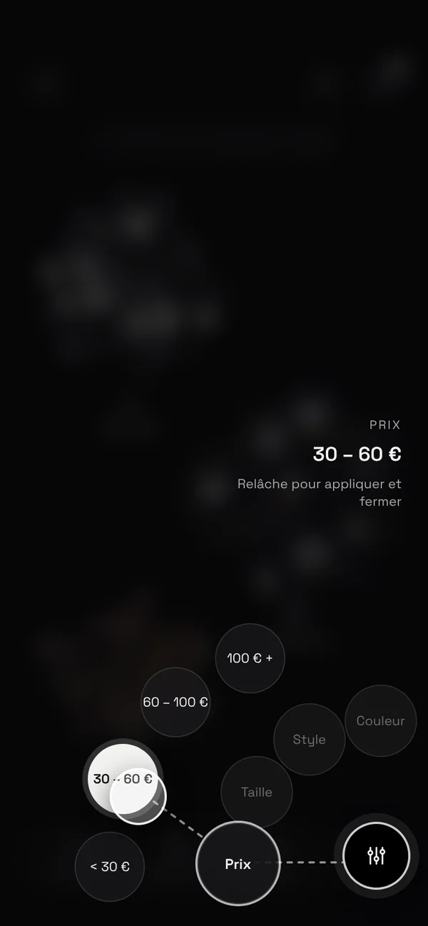
Hypothesis 6FiltersUsers understand and use the filters to refine their search.Source: scenario 2
Scenario 1Explore the map · 6 min"You want to discover new clothes. Explore the app and find a world that might interest you."Source: what we observe: the three entry points, zooming, wayfinding
Scenario 2Explore a category · 6 min"You're looking for a new T-shirt. Explore the app and refine your search to find an item that matches your taste."Source: what we observe: access to categories, filter visibility
Scenario 3Explore an influencer · 6 min"You like a piece worn by a content creator. Find it to learn more."Source: what we observe: the shift from content to product
Scenario 4Interact with a product · 9 min"You want to learn more about this garment, add it to your favorites and find the information you need to consider buying it."Source: what we observe: swipes, double tap, visual feedback
Scenario 5Make a purchase · 13 min"Select your size, add the garment to your cart and move forward with your order."Source: what we observe: sizing, the cart, the steps, friction points
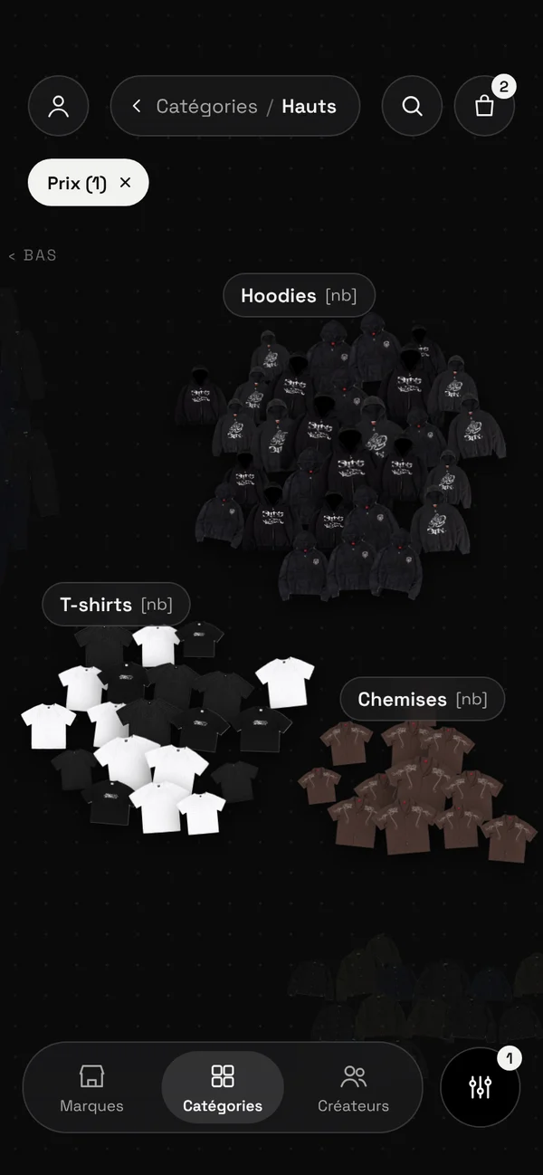
Tops screen of the prototype, with the Categories / Tops breadcrumb

One session, five rotating roles

Each session lasts 60 minutes: introduction and explanation of eye-tracking, questions about shopping habits, 40 minutes of scenarios, a debrief interview, and wrap-up. The moderator never tells participants what to do, and a transition question closes each scenario.

Our team had five people for five roles: protocol lead, timekeeper, observer, note-taker capturing verbatims, and post-test interviewer. The roles rotated with every test, so everyone saw the sessions from several angles and no single reading dominated the analysis.

To assess each hypothesis, we cross-reference three sources: direct observation (hesitations, errors, backtracking), eye-tracking (first area looked at, ignored areas, gaze path) and the interview (comprehension, feelings, expectations). The metrics we tracked: task success, time, number of errors and requests for help, and understanding of gestures without assistance.

What I take from it

With hypotheses set in advance, the results wouldn't be a general impression, but an answer for each part of the journey.

Next step · 03 The tests ↓
03The tests

Five participants, five mental models

Five students from outside the group, close to the target audience and more or less familiar with independent fashion. Over the course of the sessions, each one revealed a different way of approaching the interface.

Profile 1The overwhelmed visual typeScans the screen as a whole, ignores the onboarding text.Source: participant 1
Profile 2The standard reflexActs according to established e-commerce conventions, rejects forced interactions.Source: participant 2
Profile 3The info seekerLooks for detail and reassurance. Needs explicit affordances to understand what is clickable.Source: participant 3
Profile 4The Casual PragmatistBuys every four months, prefers shopping in-store to try things on. Needs clear navigation cues.Source: participant 4
Profile 5The Demanding ExpertBuys once or twice a month, analyzes the interface in real time, very sensitive to price and advanced features.Source: participant 5
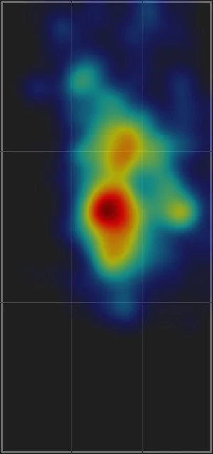
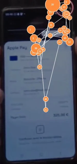
Cumulative heatmap of one session, mapped onto the phone screen

What gaze adds

In a session analyzed frame by frame, gaze lands 60% in the middle of the screen, 34% at the top, and only 7% on the bottom third, where the navigation and action buttons are.

This is where eye-tracking goes beyond observation: a participant won't tell you they didn't read an instruction. Their gaze shows that it never went there.

What I take from it

Profiles this different don't stumble over the same obstacles. What does come up across several of them, however, becomes a priority.

Next step · 04 Results ↓
04Results

An original navigation, gestures to rework

Observations were grouped by theme rather than by session, and each issue was rated: recurring if it appeared in several tests, isolated otherwise.

Verdict 1Navigation and wayfinding · needs improvementThe map and its moodboard feel are well received, but users discover late that the bubbles are clickable, and there's no simple way to get back to the home screen.Source: navigation and wayfinding hypotheses
Verdict 2Gestures and product page · priorityThe double tap is understood by everyone. Swipes, however, are interpreted differently: users expect to see more photos of the garment, not a different product.Source: gestures and features hypotheses
Verdict 3Filters · needs improvementNot always noticed, placed differently from screen to screen, and still active when switching universes.Source: filters hypothesis
Verdict 4Purchase journey · functionalThe checkout flow is understood and the confirmation is appreciated. A few bugs and a lack of reassurance about the marketplace model hold back purchase.Source: features and purchase hypotheses
5/5understand the double tap to like
4/5discover late that the bubbles are clickable
4/5expect a vertical swipe for info or photos
3/5struggle to get back to the home screen
4/4confuse the Brands and Creators universes
2/4unintentionally keep filters from one universe to the next
These figures describe the available observations, not representative success rates: the Influencers scenario was not run in every test.

“I've been browsing for two minutes and I'm only discovering this now, it's not very intuitive.”

The Demanding Expert, scenario 1

“I hadn't even realized those were other products.”

Visual overload, scenario 4
What I take from it

The card concept isn't being questioned. What causes friction is where Orbit departs from familiar habits without signaling it: the swipes, returning to the home screen, the filters.

Next step · 05 Recommendations ↓
05Recommendations

Fix what causes errors first

Each recommendation is prioritized by impact: P1 for what causes interaction errors or blocks the journey, P2 for what slows users down, P3 for comfort.

Decision 1

P1 · Gestures that follow user habits

  1. 1
    The finding

    4 out of 5 participants expect a vertical swipe for info or photos, and 3 out of 5 misread the horizontal swipe. Some add to the cart without meaning to.

  2. 2
    What I chose

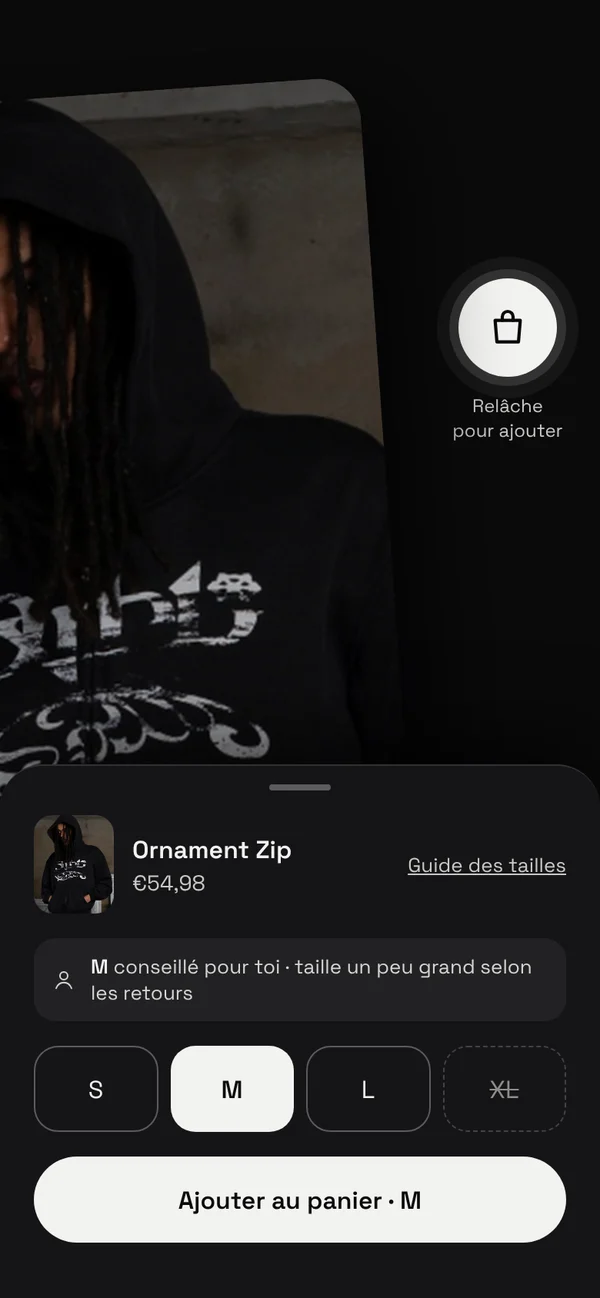
    Scroll through photos of the same product horizontally, as everywhere else, and make adding to the cart accessible through an explicit button.

  3. 3
    What I ruled out

    Keep the gestures and rely on the onboarding: eye-tracking shows its explanatory text is barely read.

  4. 4
    The expected effect

    Fewer gesture errors, and product information found before purchase.

How I would measure it: Number of erroneous gestures per session, and completion of scenario 4 without help.
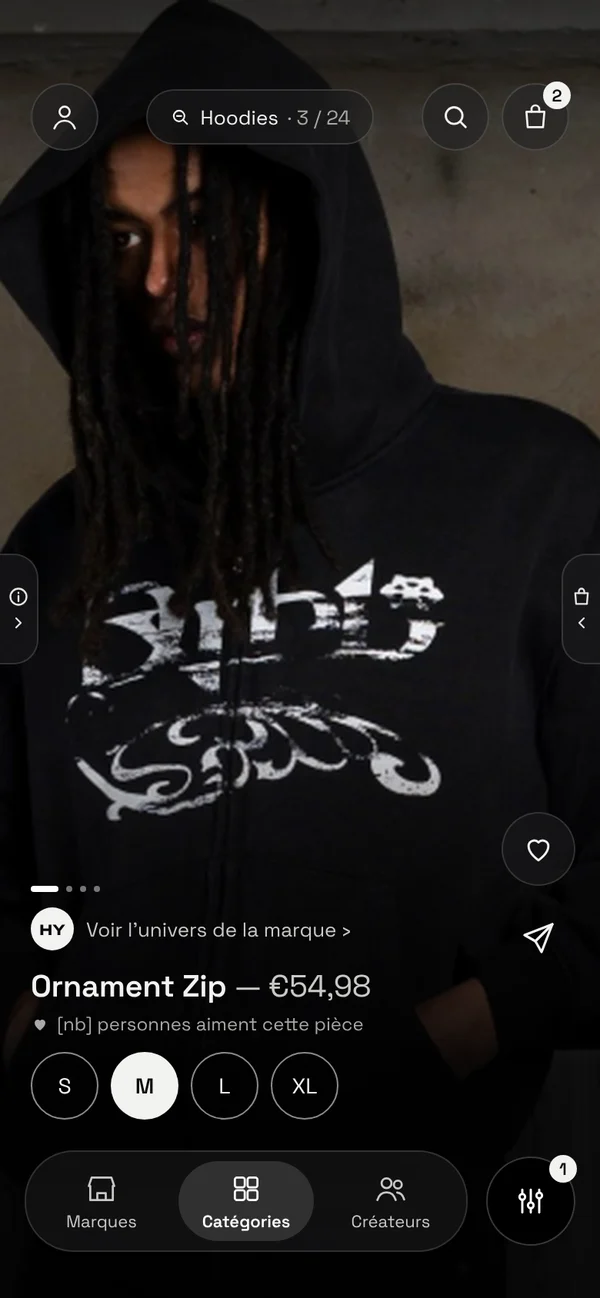
Full-screen product page in the prototype
Decision 2

P1 · Always knowing where you are

  1. 1
    The finding

    3 out of 5 participants struggle to get back to the home screen, and zooming out sometimes takes them out of the category unintentionally.

  2. 2
    What I chose

    Permanent access to the home screen, a breadcrumb that lights up when you go up a level, and categories that are clearly clickable from the home screen.

  3. 3
    What I ruled out

    Remove the zoom in favor of a standard menu, which would lose what participants appreciated most.

  4. 4
    The expected effect

    Free exploration without the fear of getting lost.

How I would measure it: Unintentional returns to the home screen and requests for help during scenarios 1 and 2.

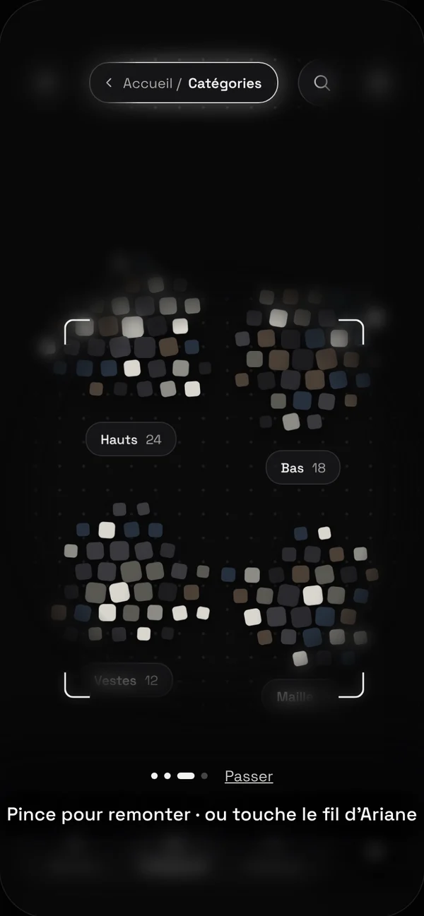
Possible fix: the Home / Categories breadcrumb lights up when you go up a level
Phase 1Priority fixes · P1Fix the bugs (size lost after the guide, confirmation too brief, zoom), clarify the gestures, add access to the home screen.Source: make interactions and navigation reliable
Phase 2Experience improvements · P2Rework the filters and their feedback, rename Créateurs to Influenceurs, strengthen the hierarchy of product pages.Source: make search and understanding easier
Phase 3Polish and validation · P3Harmonize animations, contrast and spacing, reassure users about who sells and who ships, then run another round of tests.Source: harmonize and verify the changes
What I take from it

The roadmap ends with a new round of tests: every fix remains a hypothesis until it has been verified.

Next step · 06 Takeaways ↓
06Takeaways

What the protocol taught me

A concept can win people over in the first second and make them hesitate by the thirtieth. Setting hypotheses before testing is what let me say precisely where.

What was tested

5 participants, 5 scenarios and 6 hypotheses, on November 4, 2026. The double tap and the purchase funnel hold up. The product page gestures, wayfinding and filters need to be reworked.

What I would do differently

Run the Influencers scenario with every participant so results can be compared, and analyze every session in Tobii Pro Lab rather than a single one in depth.

What I keep

[What you'll reuse: for example, turning a promise into testable hypotheses before writing a single scenario.]

Next projectGivy Box — turning a purchase into a donation
View project →