Skip to content
← All projects
Personal project · mobile app

Travel with friends, without weeks of debate

An app where the whole group sees where the trip stands: dates, destination, accommodation, expenses. Designed, coded and launched end to end.

Visit the Tison website ↗
Timeline
[Period] · ongoing
My role
Research, design, development, launch
Team
Solo, pairing with Claude (Claude Code)
Tools
Figma, Claude Code, React Native (Expo), Supabase, Brevo
The context

Planning a trip with friends takes weeks. Not because nobody wants to go, but because nobody can see where things stand.

Who's free in May? Lisbon or Barcelona? Who paid for the Airbnb upfront? Where's the train ticket? Everyone has a different piece of information, the group chat keeps growing, and the trip drags on, or never happens at all. Tison came out of this observation, which I lived through with my own friends. I wanted to see it through to the end: design the app, build it with Claude as my pair, test it, then publish it on the App Store and Google Play under my micro-business.

My starting question: How can we make sure the whole group sees the same thing, so they can decide quickly and actually go?

4stages covered: decide, pay, find, remember
14testers during the closed testing phase
2target stores, App Store and Google Play
0 €to use the app, with no ads and no subscription
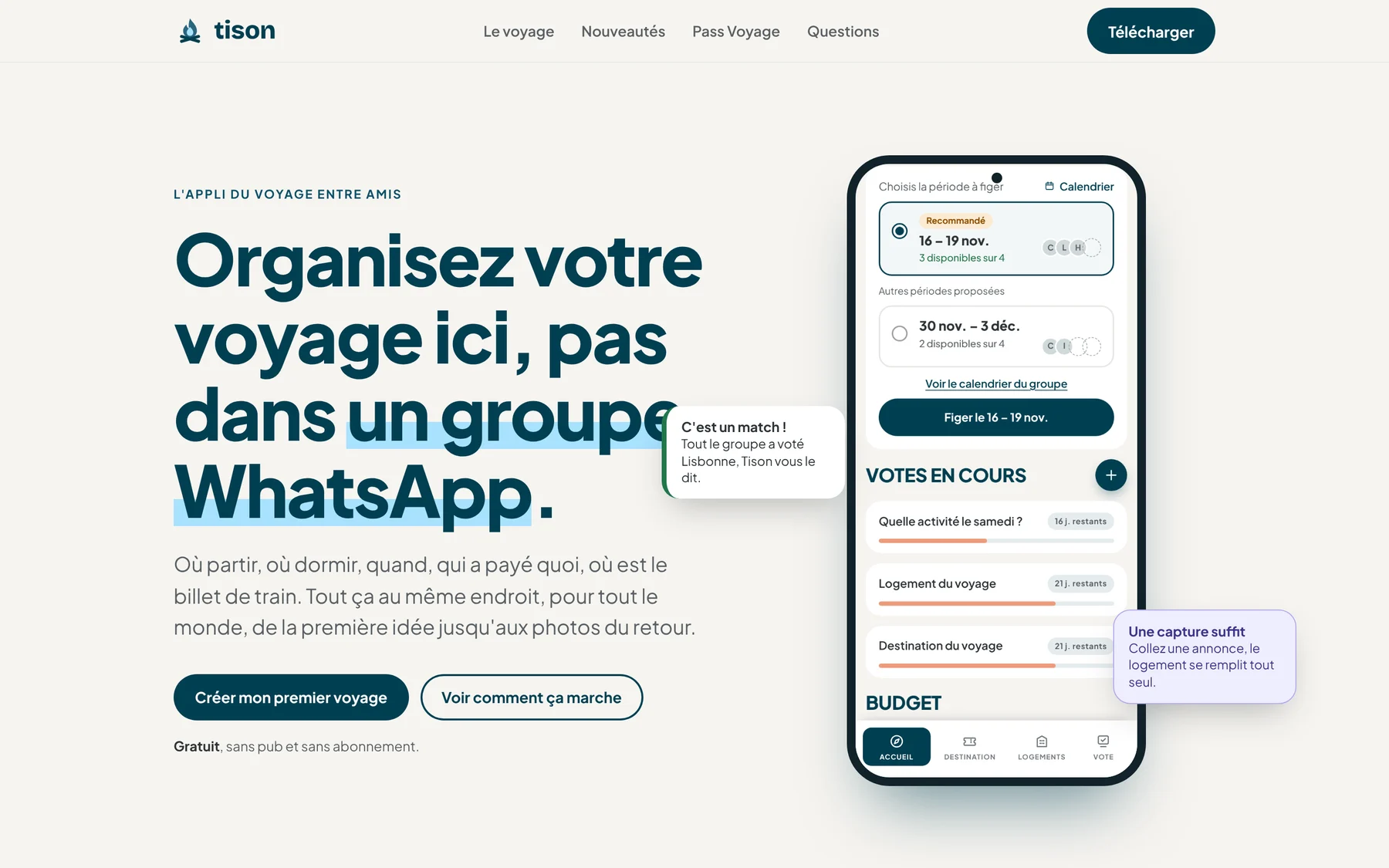
The Tison website homepage: "Plan your trip here, not in a WhatsApp group"
01Frame

Why group trips with friends never happen

Before drawing a single screen, I listed what really blocks a group of friends, from the first idea to the photos after the trip. Four moments came up every time.

Insight 1Nobody makes the callDates, destination, accommodation: everyone gives an opinion, nobody decides. "147 messages to pick a date. Still no date."Source: [my own trips, interviews with friends]
Insight 2One person fronts the moneyAccounts drag on for months after the trip, and nobody dares to follow up.Source: [my own trips, interviews with friends]
Insight 3Tickets are scatteredThe cottage booking, tickets, Wi-Fi code: it's all somewhere in a chat, impossible to find when you need it.Source: [my own trips, interviews with friends]
Insight 4Photos never get sharedEveryone goes home with their own. The shared memory never exists.Source: [my own trips, interviews with friends]
Decision 1

Don't replace the group chat

  1. 1
    The finding

    Groups already have their conversation, and they're attached to it. Asking them to switch means losing everyone from the very first invite.

  2. 2
    What I chose

    No chat in Tison. The app keeps what the conversation loses: votes, chosen dates, expenses, documents. People keep talking elsewhere, but everyone looks at the same board to decide.

  3. 3
    What I ruled out

    A built-in messenger, which would have duplicated what already exists and scattered information even more.

  4. 4
    The expected effect

    An app you open to decide, not to chat.

How I would measure it: Trips created per download, and active members per trip.
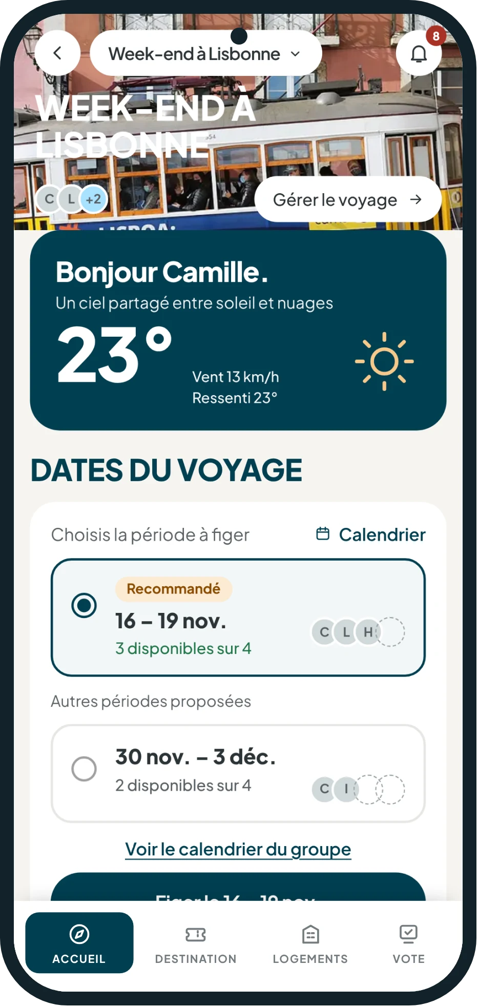
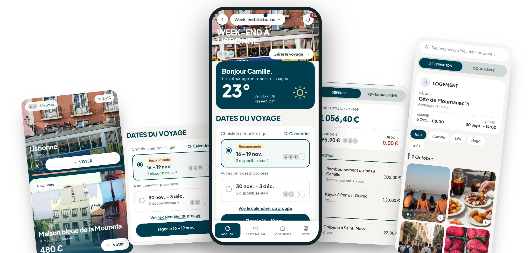
A trip's home screen in Tison, with the weather, dates and ongoing votes
What I take from it

The problem wasn't the chat tool, but the lack of a place where everyone sees the same thing. That became Tison's promise.

Next step · 02 Design ↓
02Design

A place for every stage of the trip

The app follows the trip in the order it's lived: you choose together, set the dates, split the costs, then find tickets and photos. Each screen answers one of the four findings.

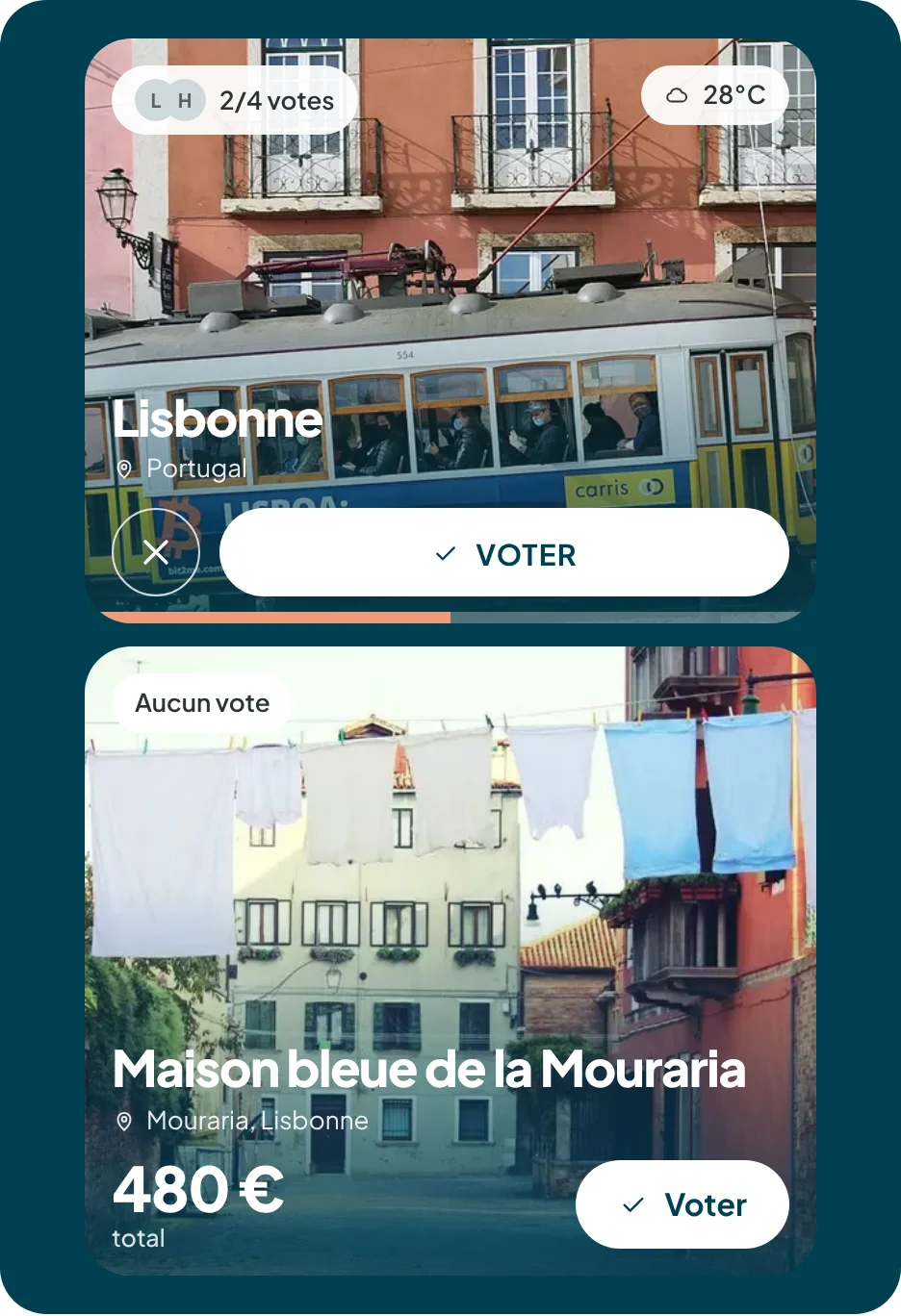
Votes: Lisbon with its weather, and a €480 place to stay still up for debate

We decide together, and no one gets left out

Everyone suggests a destination or a place to stay, and everyone votes. Each destination appears with its photo and weather, and accommodations can be compared by photos, price and bedrooms.

When an idea appeals to everyone, Tison lets the group know: it's a match. Not sure about Saturday? A poll, or the wheel decides.

Decision 1

Suggesting a period instead of running a poll

  1. 1
    The finding

    A date poll forces everyone to tick boxes, then someone has to count the answers and chase people up. That's where the trip stalls.

  2. 2
    What I chose

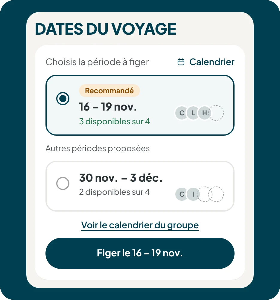
    Everyone says when they're free. Tison spots the period that works for the most people, highlights it with the number of people available, and all that's left is to lock it in with one tap.

  3. 3
    What I ruled out

    A standard multiple-choice poll, which leaves all the decision-making work to the group.

  4. 4
    The expected effect

    Dates locked in at once, and the whole group notified.

How I would measure it: [Time between trip creation and locked dates]

The recommended period on the dates screen
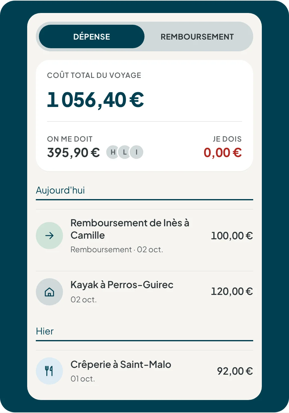
Budget: total trip cost, what I'm owed, what I owe, and the latest expenses

The numbers take care of themselves

You log an expense in a few seconds, saying who paid and for whom. Tison works out who owes what to whom, with as few transfers as possible, and converts currencies when abroad.

The screen shows only the two numbers that matter to each person: what I'm owed, and what I owe. When someone pays back, you confirm it and the balances update.

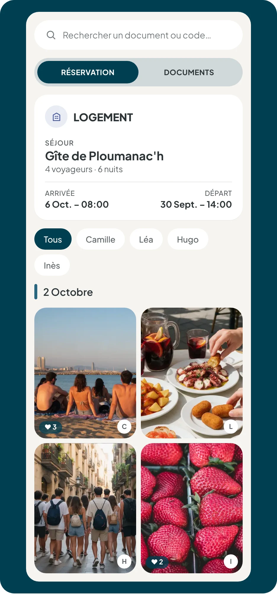
The Vault: accommodation booking, documents, and the shared gallery sorted by day

The Vault, for what you need at 11 p.m. in front of the door

The cabin booking, the tickets, the Wi-Fi code: everything is kept in one place, with search. And at the end of the trip, a shared gallery sorted by day and filterable by person.

The trip ends with a postcard, awards voted on by the group, and an export of everyone's favorite photos.

What I take from it

Four insights, four spaces. Now the app had to stand on its own, and make people want to open it.

Next step · 03 Build ↓
03Build

Designing and developing with Claude

I'm not a developer. Tison is built as a pair with Claude: I handle the design, product decisions and testing, and Claude writes and fixes the code with me.

The app is built in React Native with Expo, on a Supabase backend. I broke the build down into a roadmap of prompts, one per feature, and connected Figma to the code so that the mockups and the design system remain the source of truth: colors, typography, components.

Working this way forced me to write precise specifications. A poorly described screen produces the wrong screen. It's the same rigor as a handoff to a development team, just shorter.

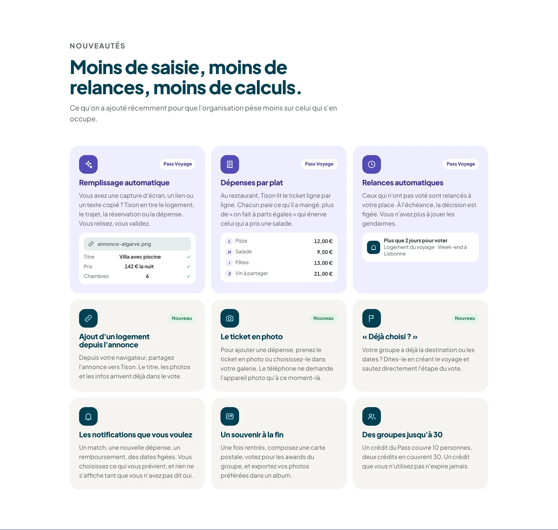
What's new: autofill, per-dish expenses, automatic reminders, adding accommodation from a listing, receipt photos
Added after the closed beta: less typing, fewer reminders, less math for whoever is organizing.
Decision 1

Free, ad-free, and a Pass for the group

  1. 1
    The finding

    A group app only works if everyone installs it. A subscription or ads would have scared off invited friends.

  2. 2
    What I chose

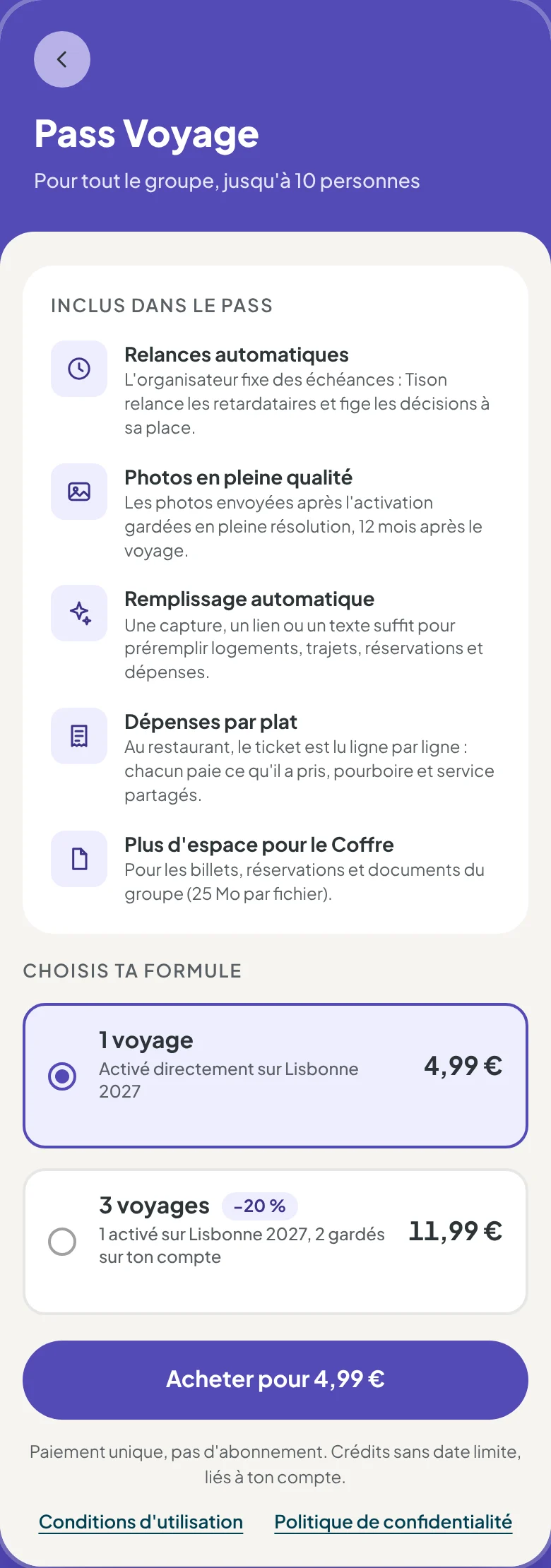
    Tison stays free. The Trip Pass is a one-time, optional purchase: one person pays, and the whole group benefits (autofill, reminders, full-quality photos, more space in the Vault).

  3. 3
    What I ruled out

    A monthly subscription per person, or ads.

  4. 4
    The expected effect

    No barrier to inviting friends, and revenue tied to the trip itself.

How I would measure it: [Share of trips with an active Pass]

The Trip Pass screen and its plans
What I take from it

The app was ready. What remained was the hardest part of a personal project: getting people to discover it.

Next step · 04 Launch ↓
04Launch

Changing the culprit

For the launch, I wrote a communication strategy: a landing page, a waitlist, and short videos on TikTok and Instagram. Then I reworked the angle before the first post.

Decision 1

Blaming the wasted time, not WhatsApp

  1. 1
    The finding

    The first message read "Group trips without the WhatsApp group chaos." But groups like their chat, and Tison doesn't replace it: blaming the tool rang false.

  2. 2
    What I chose

    The real problem is time: weeks spent getting everyone to agree, because no one can see where things stand. New promise: "Group trips, without weeks of getting everyone to agree."

  3. 3
    What I ruled out

    Keeping WhatsApp as the enemy: catchier, but at odds with the product.

  4. 4
    The expected effect

    A message aligned with what the app actually does.

How I would measure it: 3-second retention on the videos, and the pain points cited by sign-ups in reply to the welcome email.

The Tison landing page

“Tison is the app where the whole group sees where the trip stands, so you can stop spending weeks trying to agree.”

The promise, in one sentence
150sign-ups targeted on the waitlist
> 60 %3-second retention on videos
> 20 %sign-up rate among landing page visitors
> 30 %of downloads that create a trip
The thresholds set before launch. The last one is the real product metric: a download with no trip created is a lost sign-up. [Results coming soon]
What I take from it

A good product isn't enough: you need a single pain point, expressed in the words of the people who live it.

Next step · 05 Takeaways ↓
05Takeaways

What Tison is teaching me

Running a product on my own, from idea to app stores, means constantly making trade-offs between what's useful, what's feasible and what's understandable.

What was tested

[Feedback from the 14 testers: what they liked, what was fixed]

What I would do differently

[What you would change today]

What I keep

Writing precise specifications, and testing every decision against real usage rather than intuition.

Next projectBoubou — a voice copilot for bakeries
View project →