Skip to content
← All projects
Work-study · Le Livre de Poche

Redesigning newsletters read by 100,000 subscribers

A year spent bringing books to life online: social media, newsletters, motion and merchandise, with the redesign of the email system at the center.

Timeline
Sept. 2023 – Oct. 2024
My role
Graphic, web and motion designer
Team
[Marketing / communication team, n people]
Tools
[Figma, Photoshop, After Effects, email tool]
The context

A paperback publisher releases hundreds of titles a year. My role: bringing them to life online, in Instagram feeds as well as in the inboxes of 100,000 subscribers.

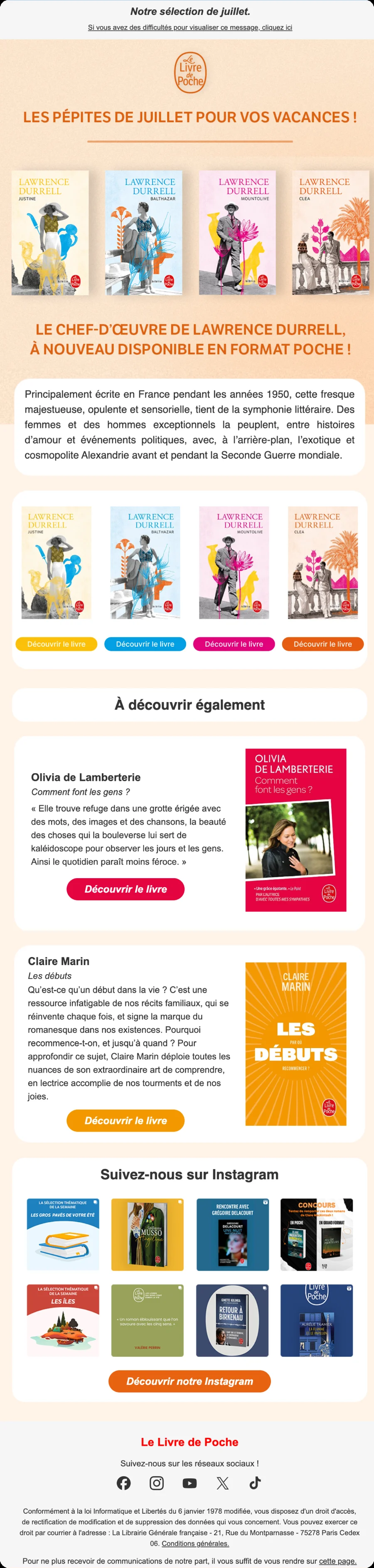
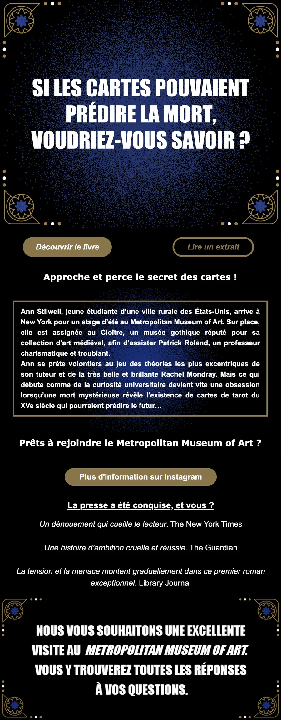
During my studies, I spent a year in a work-study program at Le Livre de Poche as a graphic designer, web designer and motion designer. I designed social media posts, newsletters, animations and merchandise. The most defining project was the redesign of the email system.

My starting question: How do you make people want to open one more newsletter when they already receive dozens every day?

100knewsletter subscribers
13 monthswork-study
3channels: social media, email, merchandise
[n]newsletters designed
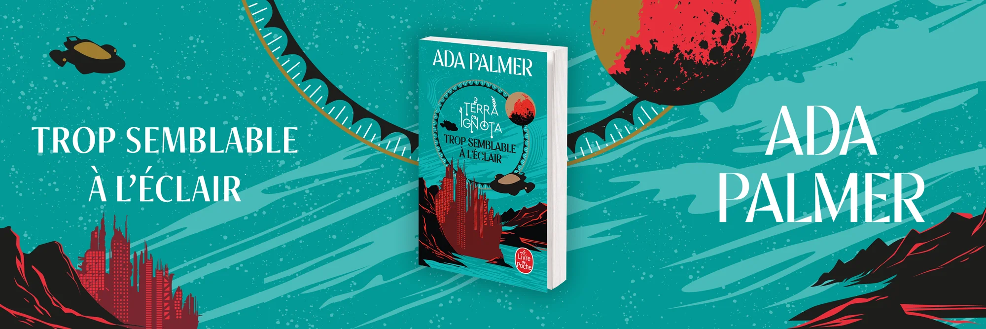
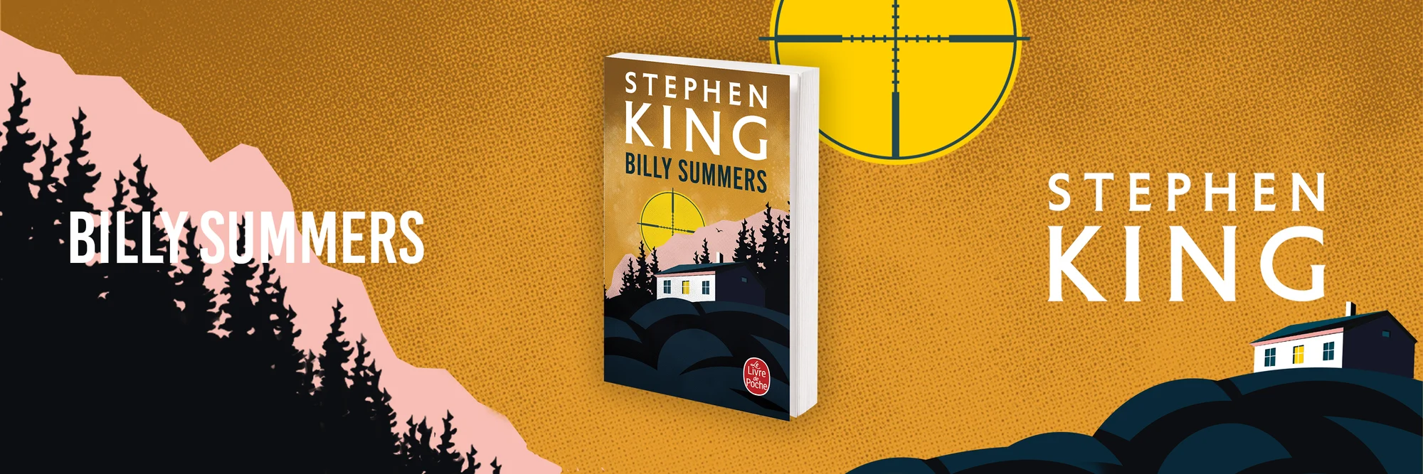
Banner for Billy Summers by Stephen King
01Understand

One newsletter among dozens

Before touching the templates, I needed to understand how subscribers actually read these emails: on which screen, for how long, and what made them click.

Finding 1[Finding on mobile reading][For example: the share of opens on mobile, and what that implies for the layout]Source: [emailing tool statistics]
Finding 2[Finding on clicks][Which blocks were clicked, which were ignored]Source: [click statistics]
Finding 3[Finding on production][What made each newsletter long or difficult to produce]Source: [conversations with the team]
What I take from it

[What these findings taught you, in one or two sentences: for example, that the newsletter needed a mobile-first format that was also simpler to produce every week.]

Next step · 02 Redesign ↓
02Redesign

A reimagined emailing system

[What you changed: template structure, content hierarchy, mobile readability, button placement, and why.]

Decision 1

[Key decision of the redesign]

  1. 1
    The finding

    [The initial finding that motivated this choice]

  2. 2
    What I chose

    [What you put in place]

  3. 3
    What I ruled out

    [The option you ruled out, and why]

  4. 4
    The expected effect

    [What you expected from it]

How I would measure it: [The open or click rate you tracked]
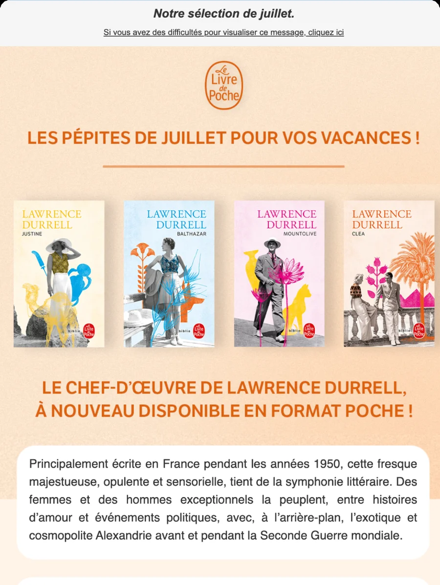
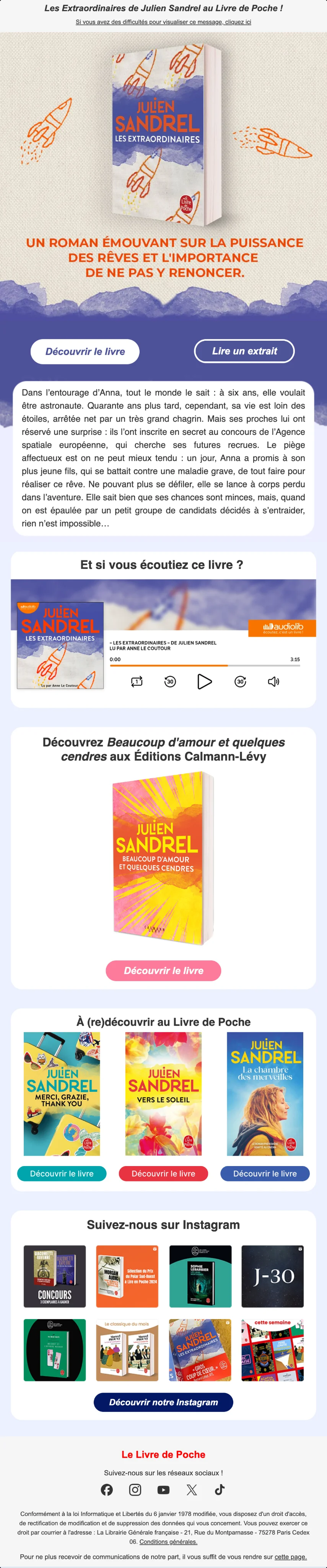
Top of the Les pépites de juillet newsletter
What I take from it

[What the redesign changed for the team and for readers.]

Next step · 03 Engage ↓
03Engage

Bringing books to life on social media

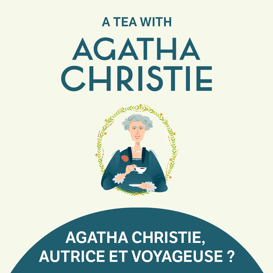
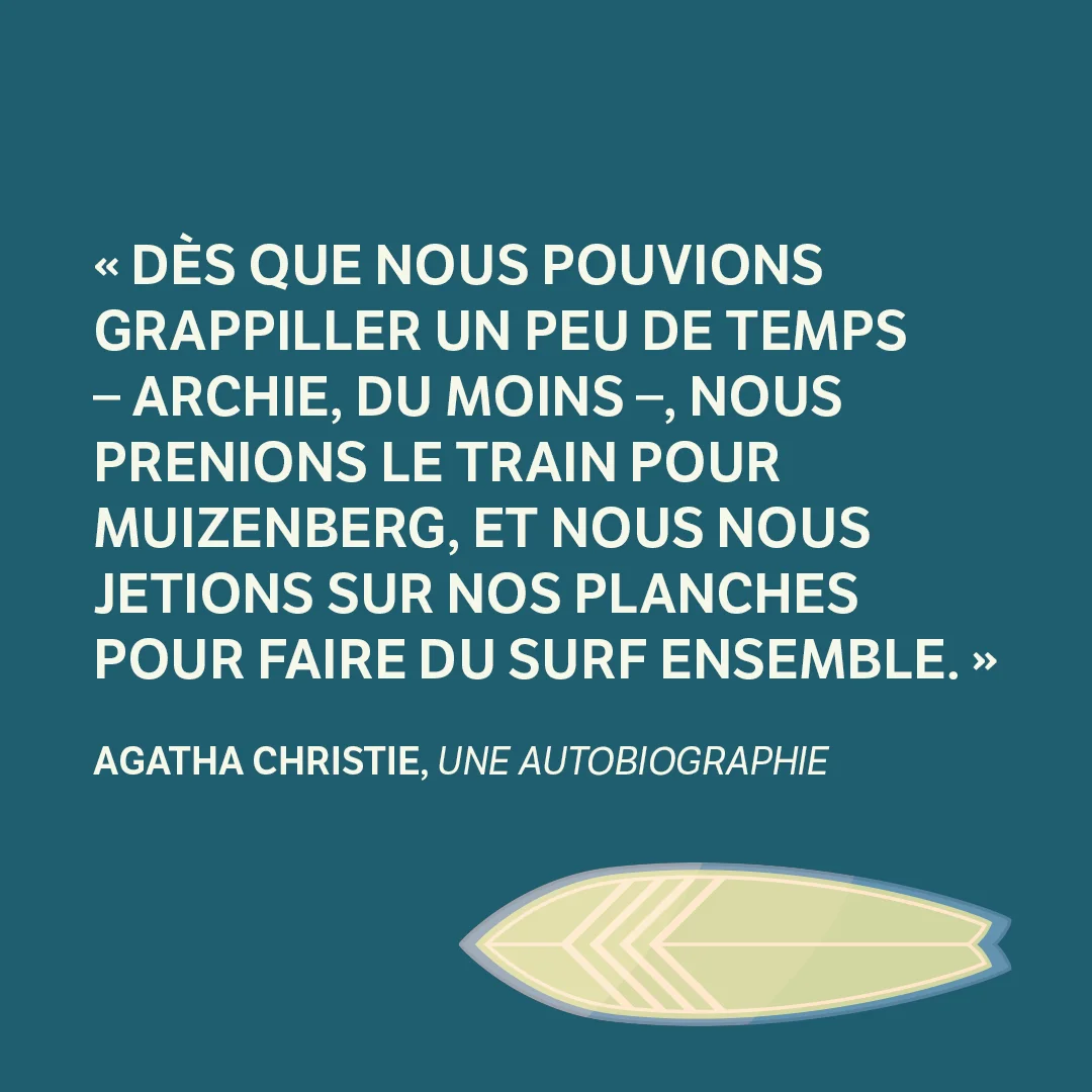
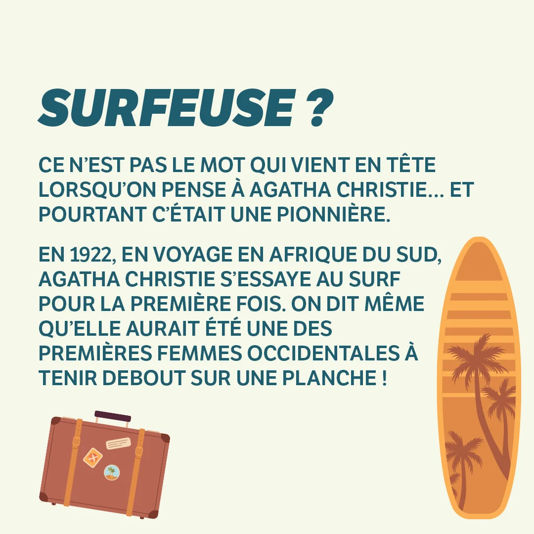
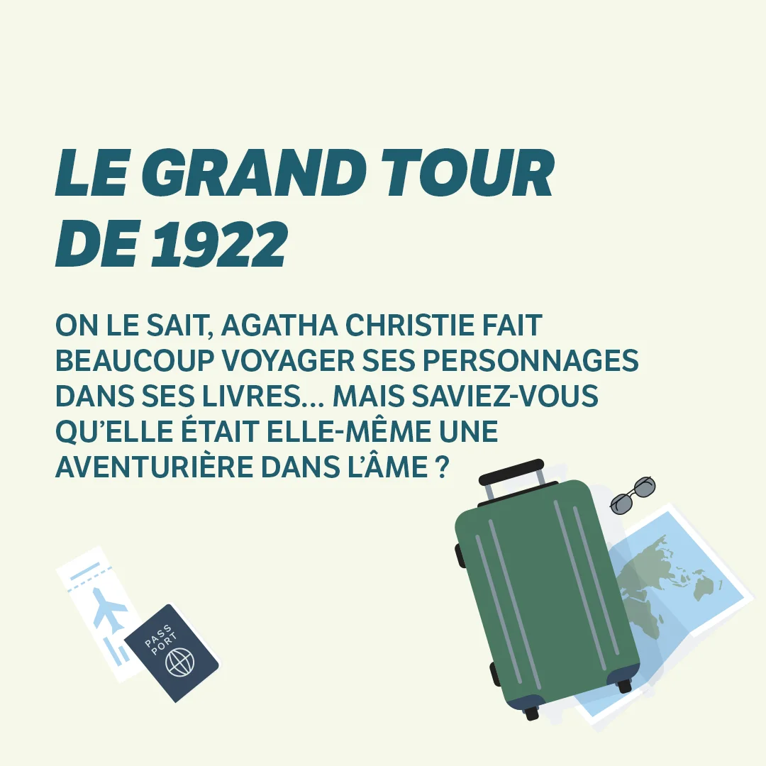
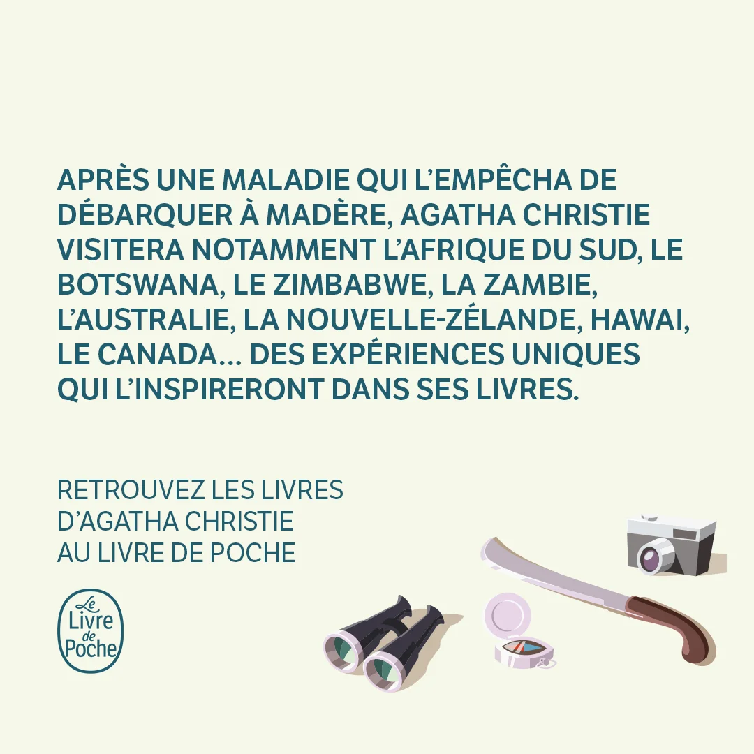
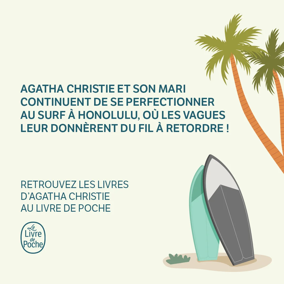
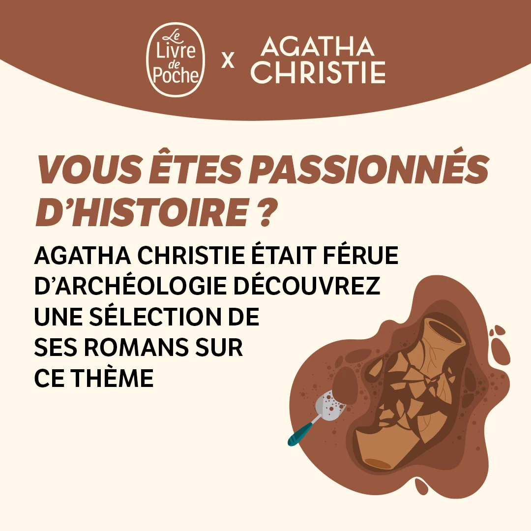
Alongside the newsletters, I designed content for social media: themed carousels, release banners, and logo variations for key moments of the year.

What I take from it

[What social media taught you about capturing attention, which later proved useful for newsletters.]

Next step · 04 Takeaways ↓
04Takeaways

What this work-study taught me

[A one-sentence takeaway: for example, that my work wasn't judged on the screen, but on what readers did with it.]

What was tested

[Open or click rates before and after the redesign, if available]

What I would do differently

[What you would do differently today, with your UX designer's eye]

What I keep

[What made you want to move from graphic design to user research]

Next projectDn’D — e-commerce interfaces and CRO analyses
View project →