Skip to content
← All projects
Academic project · not commercialized

Fixing your motorcycle without going to the shop

Doc2Wheels — designing the journey of a stranded motorcyclist, from the request for help to the on-site repair.

Timeline
March – May 2024 · 3 months
My role
UX research, journey mapping, UI
Team
Me + [n] art directors
Tools
Figma, [other tools]
The context

A broken-down motorcycle can't ride to the garage. Doc2Wheels starts from that paradox: bring the mechanic to the rider, rather than the other way around.

A three-month academic project. The brief: imagine a mobile repair service for motorcycles and scooters, at home, at the office or by the roadside, and design the app that makes it possible.

My starting question: At what moment does a stranded rider feel most helpless, and how can the app step in at that precise moment?

6journey stages mapped
10high-fidelity screens designed
2subscription plans
50 ktarget users at launch
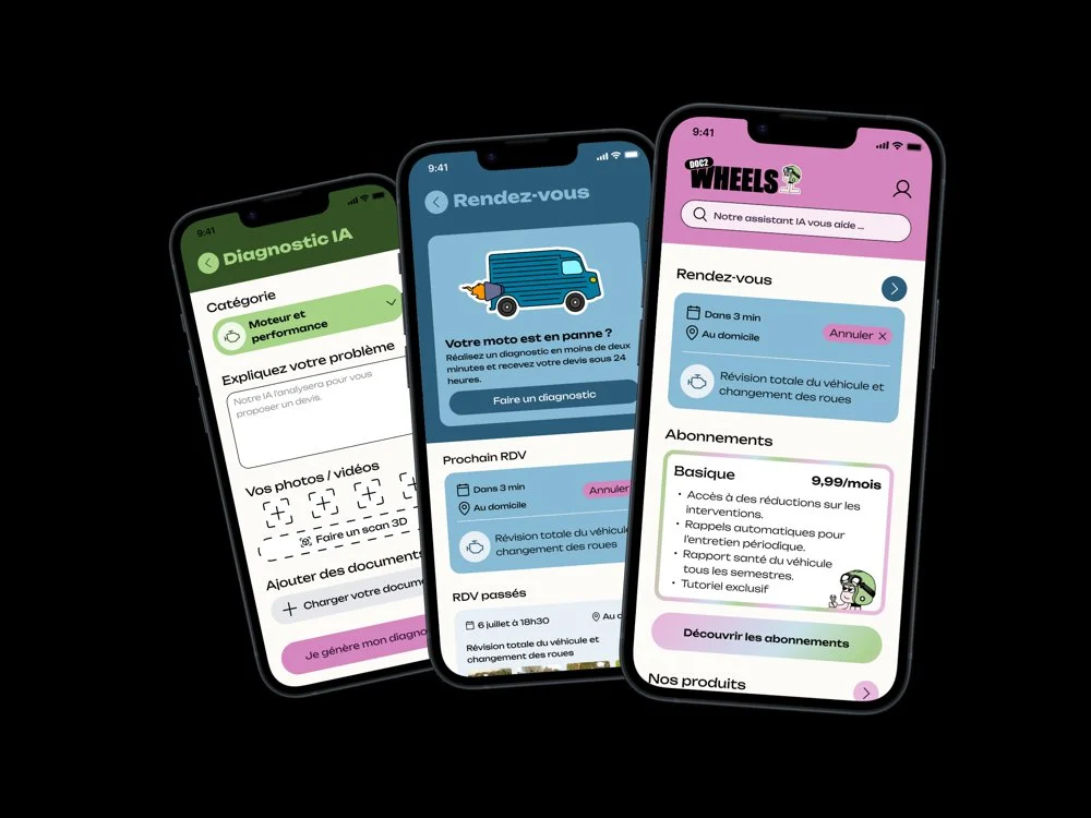
Three screens of the Doc2Wheels app
01Understand

The journey of a stranded motorcyclist

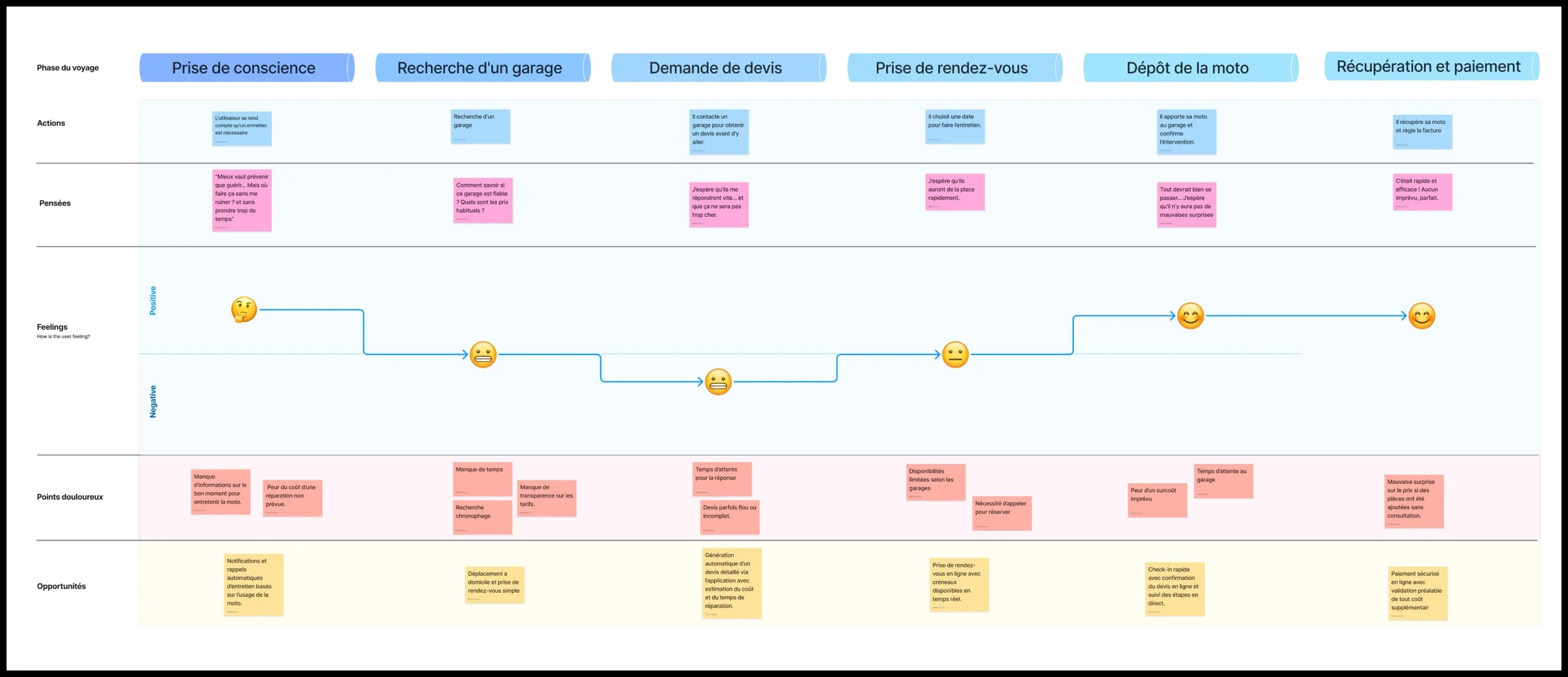
Before drawing a single screen, I mapped the current journey, from the moment the rider realizes something is wrong to picking the bike back up. For each stage: what the rider does, thinks and feels, and what blocks them.

Six-stage experience map: realizing the breakdown, finding a garage, requesting a quote, booking an appointment, dropping off the bike, pickup and payment
Experience map: actions, thoughts, feelings, pain points and opportunities at each stage.
Finding 1The low point is the quote requestThis is the stage where the emotion curve drops the lowest: the rider knows neither how much the repair will cost nor when the bike will be taken care of.Source: experience map
Finding 2[Second pain point][What you observed, and why it matters for what follows]Source: [interview, survey, benchmark]
Finding 3[Third pain point][What you observed]Source: [source]

“[The strongest quote heard during the research]”

[Profile of the rider interviewed]
What I take from it

The real problem isn't the repair itself, it's the uncertainty that comes before it: how much, when, by whom. The app has to answer these three questions before the mechanic even sets out.

Next step · 02 Frame ↓
02Frame

An accessible service, designed for volume

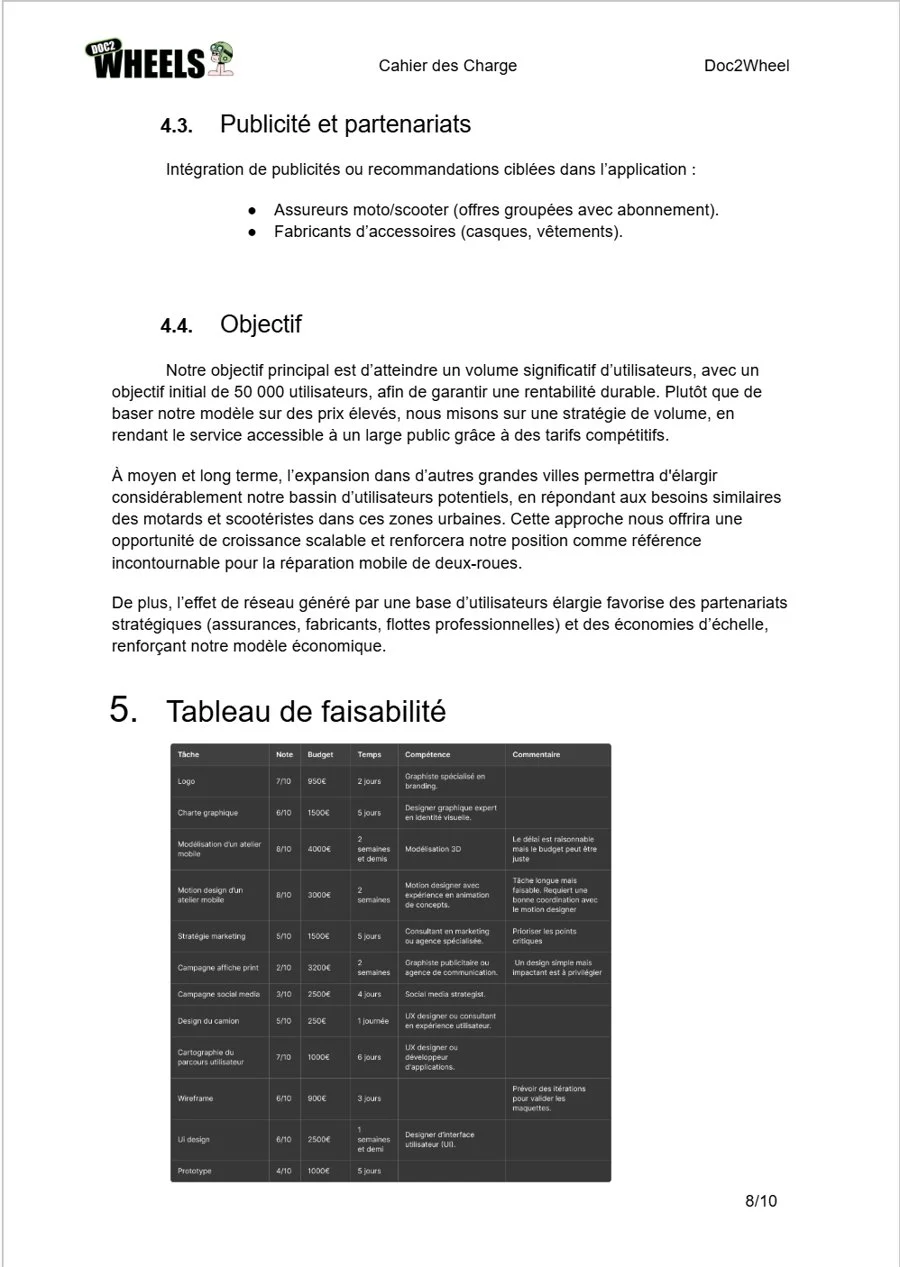
The requirements document set the ambition: 50,000 users at launch, with affordable pricing rather than a premium model. Aiming for volume means designing for riders of all levels: the app has to be understandable without any help.

Requirements document page: objective and feasibility table

From requirements to information architecture

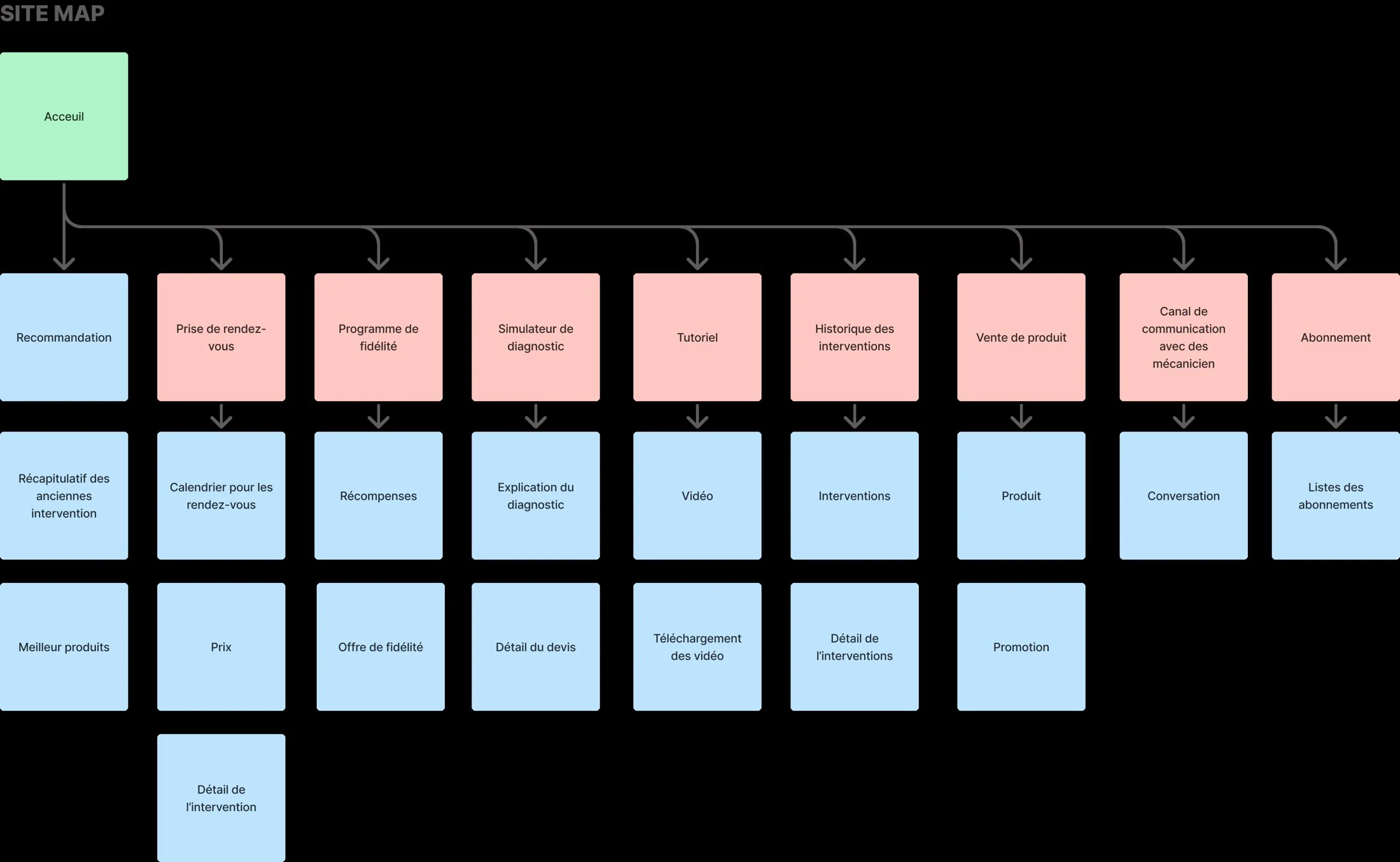
I organized the app around the questions a rider asks themselves, not around the company's services: "What's wrong?" leads to diagnosis, "When?" to booking, "Who?" to the experts.

[What guided the grouping of sections, and what you deliberately left out.]

Site map of the Doc2Wheels app
Site map of the app.
What I take from it

Few entry points, riders' language and no garage jargon: the architecture was in place. What remained was bringing it to life screen by screen.

Next step · 03 Design ↓
03Design

From paper to screen

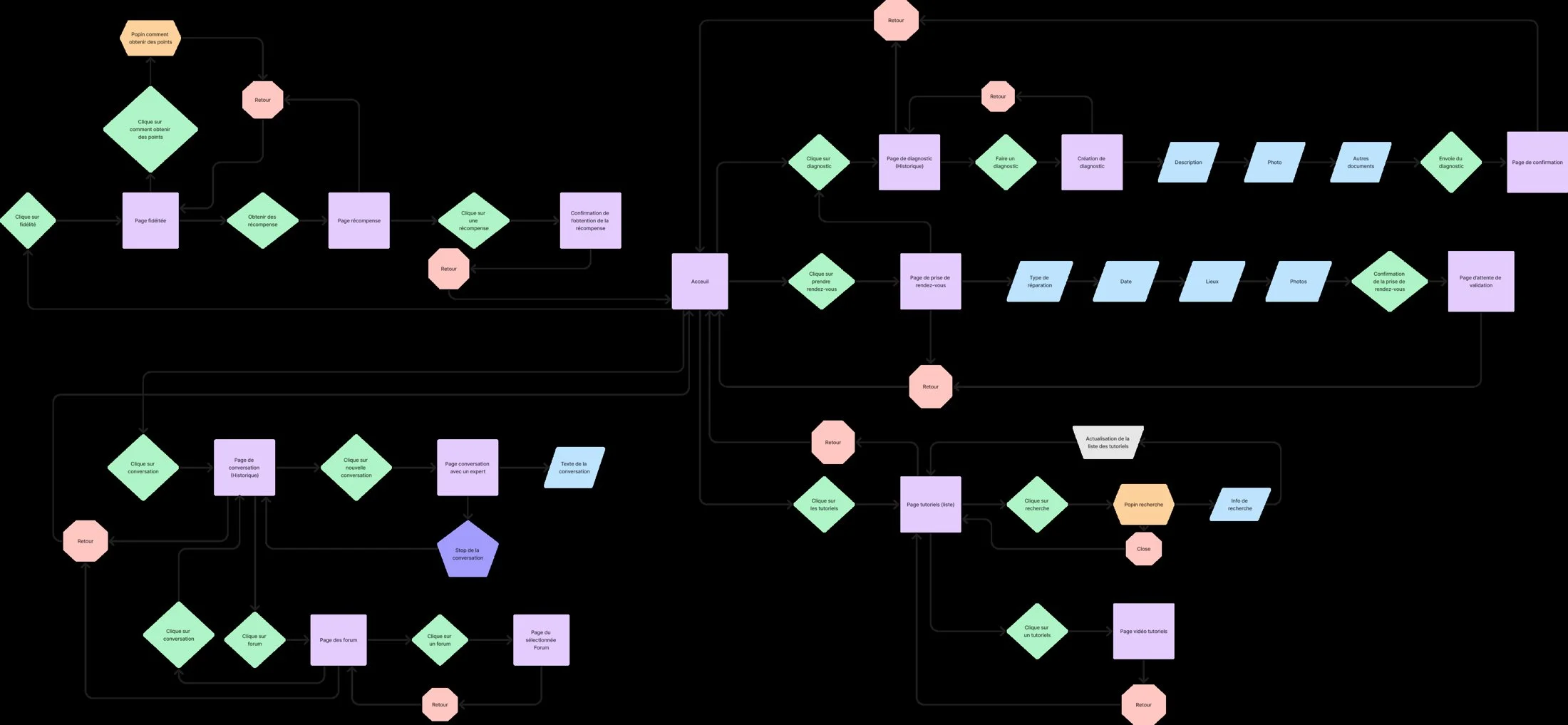
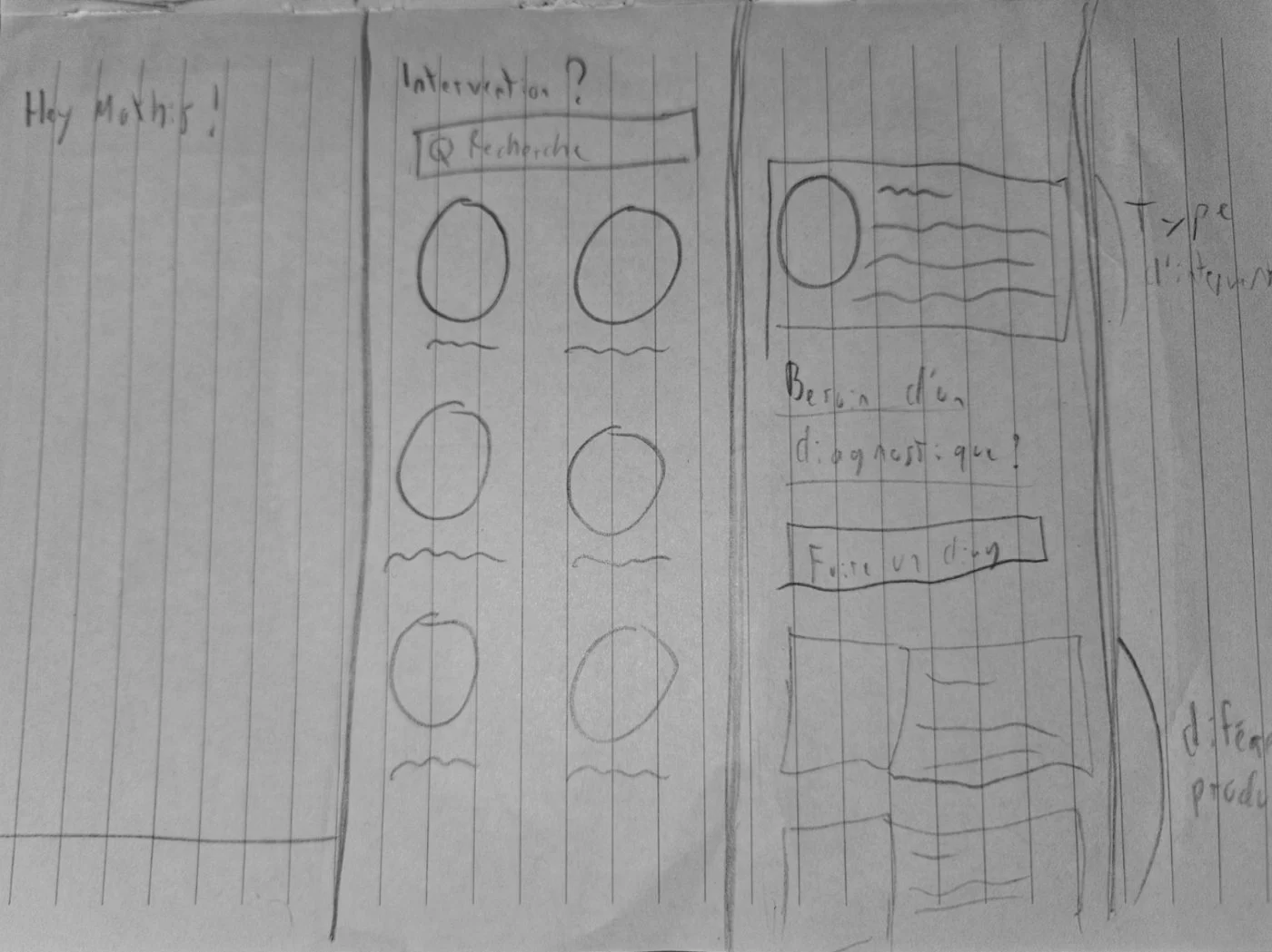
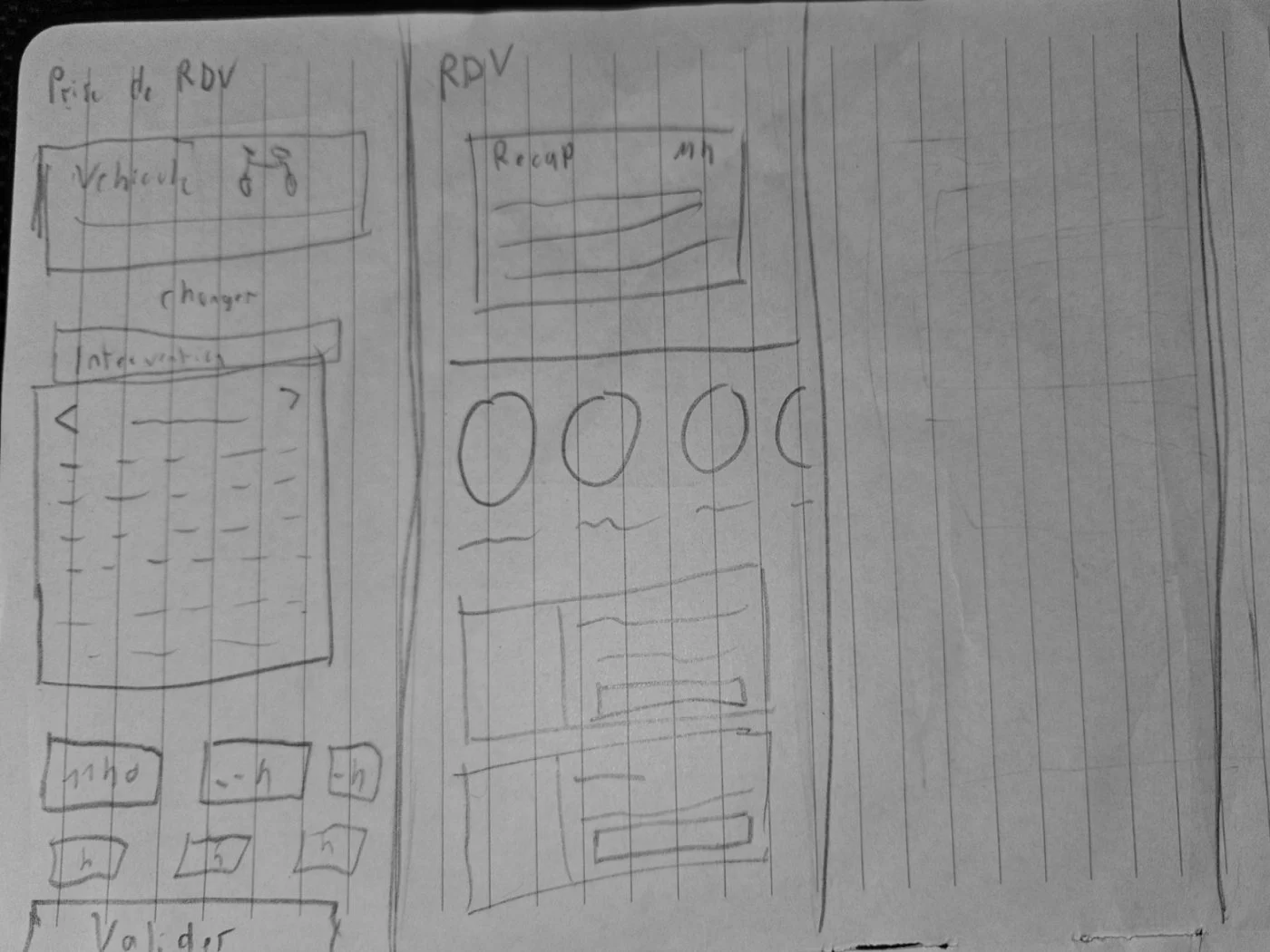
I first drew the user flow to make sure no path led to a dead end, then sketched the screens by hand. Paper lets you test quickly, without getting attached to visual details.

App user flow
User flow: each diamond is a user choice.
Paper wireframe of the diagnostic screens
Paper wireframes: the diagnostic.
Paper wireframe of the appointment booking
Paper wireframes: appointment booking.

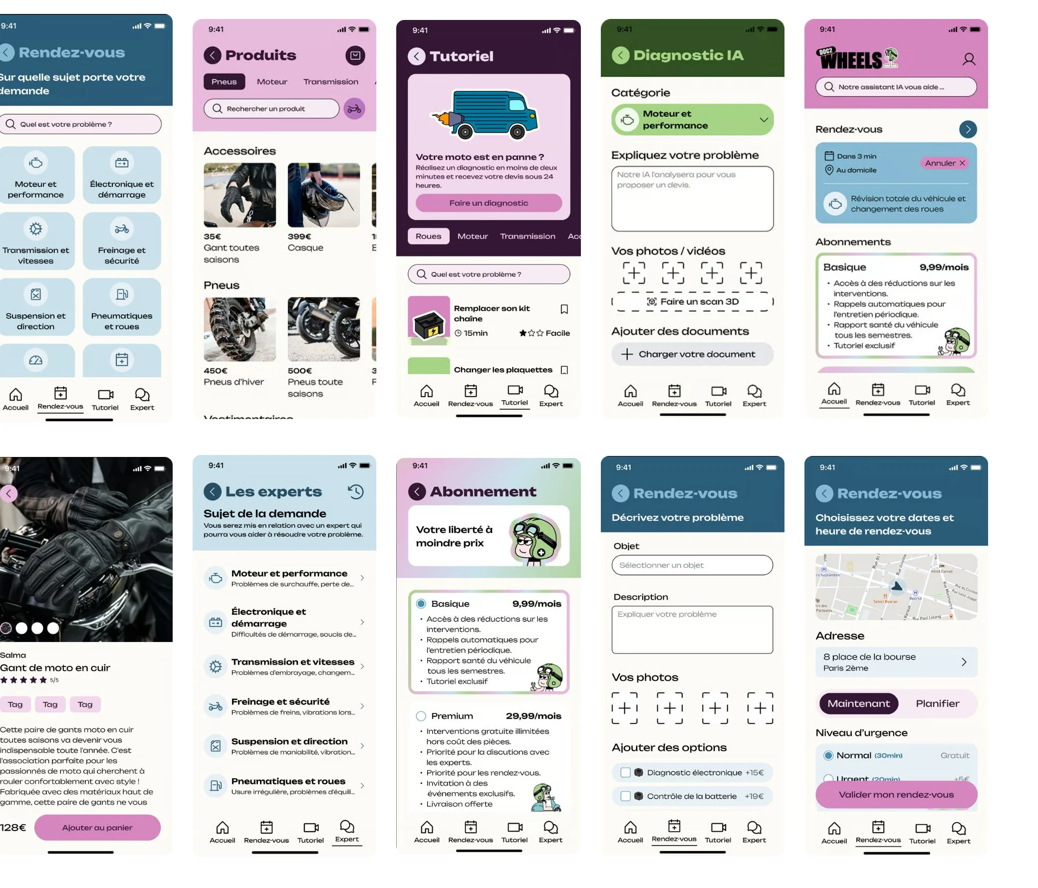
[What changed between paper and high fidelity, and why.]

Ten screens of the Doc2Wheels app
The high-fidelity screens.
What I take from it

The mockups revealed three moments where everything is decided: before the repair, when booking the appointment, and after the repair. Each one called for a clear design choice.

Next step · 04 Decide ↓
04Decide

Three choices that change the journey

Each decision starts from a research finding, rules out at least one alternative, and aims for an effect we could measure.

Decision 1

A diagnostic before any trip

  1. 1
    The finding

    Requesting a quote is the lowest point of the journey: riders have no idea what the repair will cost them.

  2. 2
    What I chose

    A remote diagnostic: fault category, description, photos, videos, even a 3D scan, analyzed by an AI that suggests a quote.

  3. 3
    What I ruled out

    A simple phone call to an advisor, which depends on opening hours and doesn't scale to 50,000 users. And a free-text form, too vague for someone who isn't a mechanic.

  4. 4
    The expected effect

    A quote known before the trip, and a mechanic who arrives with the right part.

How I would measure it: Share of quotes accepted, and share of repairs completed on the first visit.
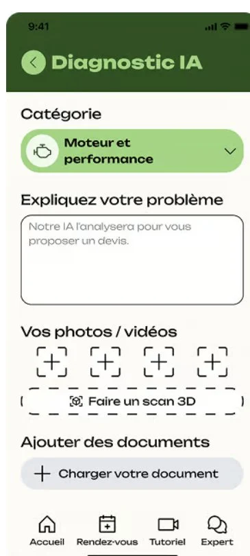
AI Diagnostic screen: category, problem description, photos and videos
Decision 2

Now or later: urgency at the heart of the appointment

  1. 1
    The finding

    A motorcycle stranded at the side of the road and a service planned for next month are not the same need.

  2. 2
    What I chose

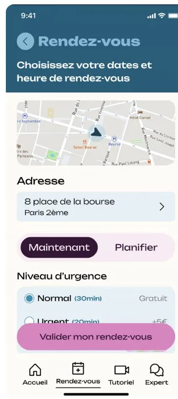
    Separate "Now" and "Schedule" from the start, then ask for the urgency level and the location of the service.

  3. 3
    What I ruled out

    A single calendar for all appointments, which would force a rider in distress to look for a slot like everyone else.

  4. 4
    The expected effect

    A response time adapted to the situation, and a rider who feels reassured from the very first seconds.

How I would measure it: Average time between the request and the mechanic's arrival, for each urgency level.

Appointment screen: address, now or schedule, urgency level
Decision 3

A subscription to stay present after the breakdown

  1. 1
    The finding

    A breakdown is a one-off event: without a follow-up, the relationship ends with the repair. And the target model relies on volume, not high prices.

  2. 2
    What I chose

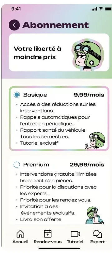
    Two plans, Basic at €9.99 and Premium at €29.99 per month: discounts, maintenance reminders, vehicle health report.

  3. 3
    What I ruled out

    Pay-per-use alone, which doesn't build loyalty. And a single flat plan, with no low-priced entry point.

  4. 4
    The expected effect

    Riders who come back for maintenance, and therefore fewer avoidable breakdowns.

How I would measure it: Subscription rate after a first repair, then retention at 3 and 6 months.

Subscription screen: Basic and Premium plans
What I take from it

The journey held together. Now it had to be appealing, and speak to all riders, not just enthusiasts.

Next step · 05 Embody ↓
05Embody

A brand far from biker clichés

A brand open to everyone, which highlights mutual help rather than speed. It's the logical next step of the "volume" positioning: an identity that excludes no one. Identity and motion design by [who].

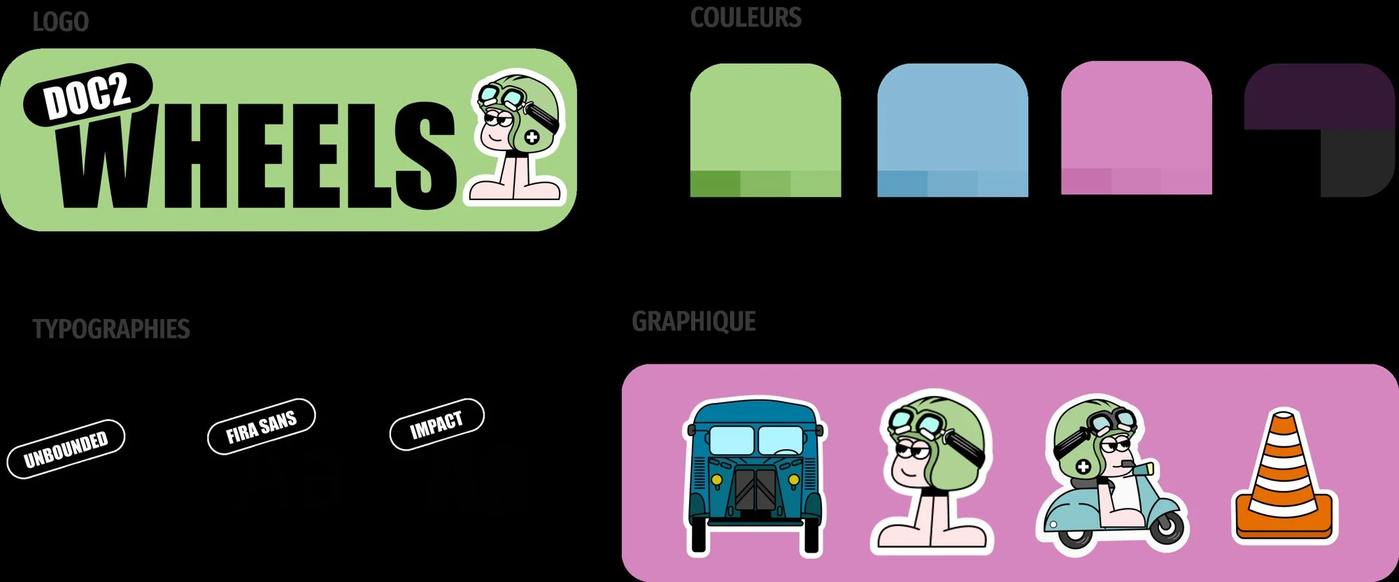
Identity board: logo, colors, typefaces, illustrations
Logo, colors, typefaces and illustrations.
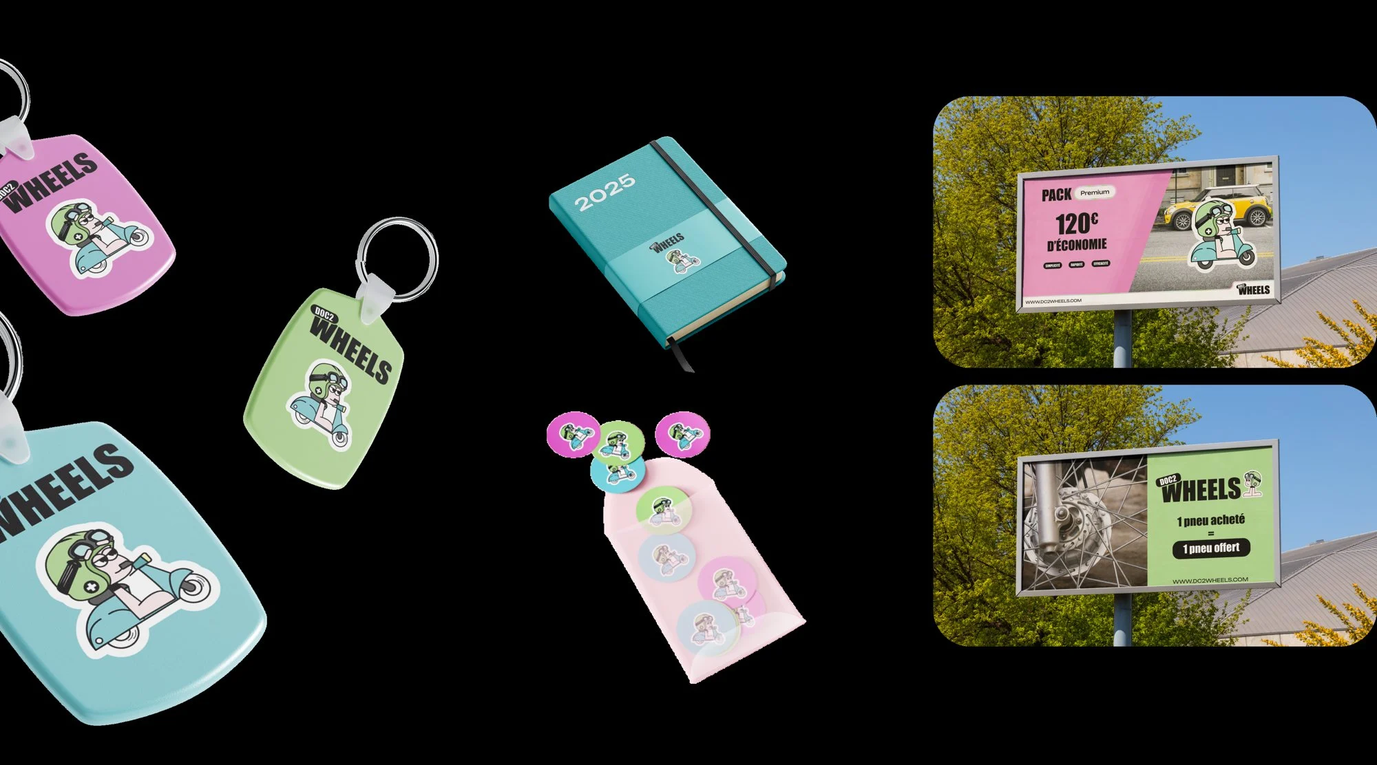
Brand applications: keychain, notebook, badges, posters
Print applications and merchandise.
What I take from it

One service, one journey, one brand. The question that matters remains: how much is all of this worth in front of real motorcyclists?

Next step · 06 Takeaways ↓
06Takeaways

What the project taught me

[An honest wrap-up sentence: what worked, what still needs to be proven.]

What was tested

[n participants, task tested, result]

What I would do differently

[A limitation I acknowledge and what I would change]

What I keep

[The lesson I applied afterwards, at Dn'D or BNP]

Next projectNike Mentality — a fitness tracking app
View project →